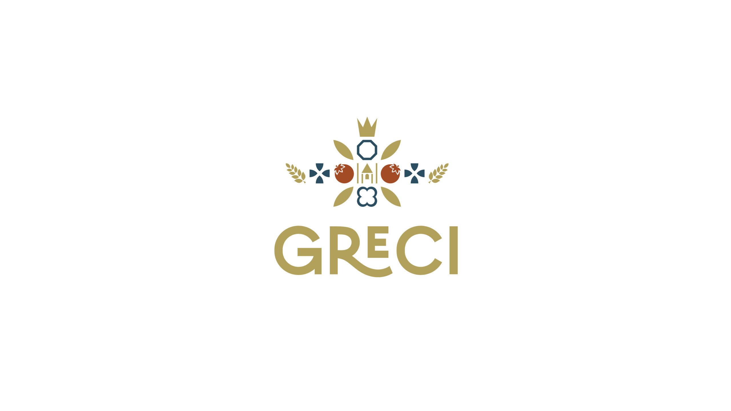
A touch of Romagna on your table.
Client
Greci Industria Alimentare
Year
2023
Services
Brand Strategy
Design
Illustration
Links


Sineddoche
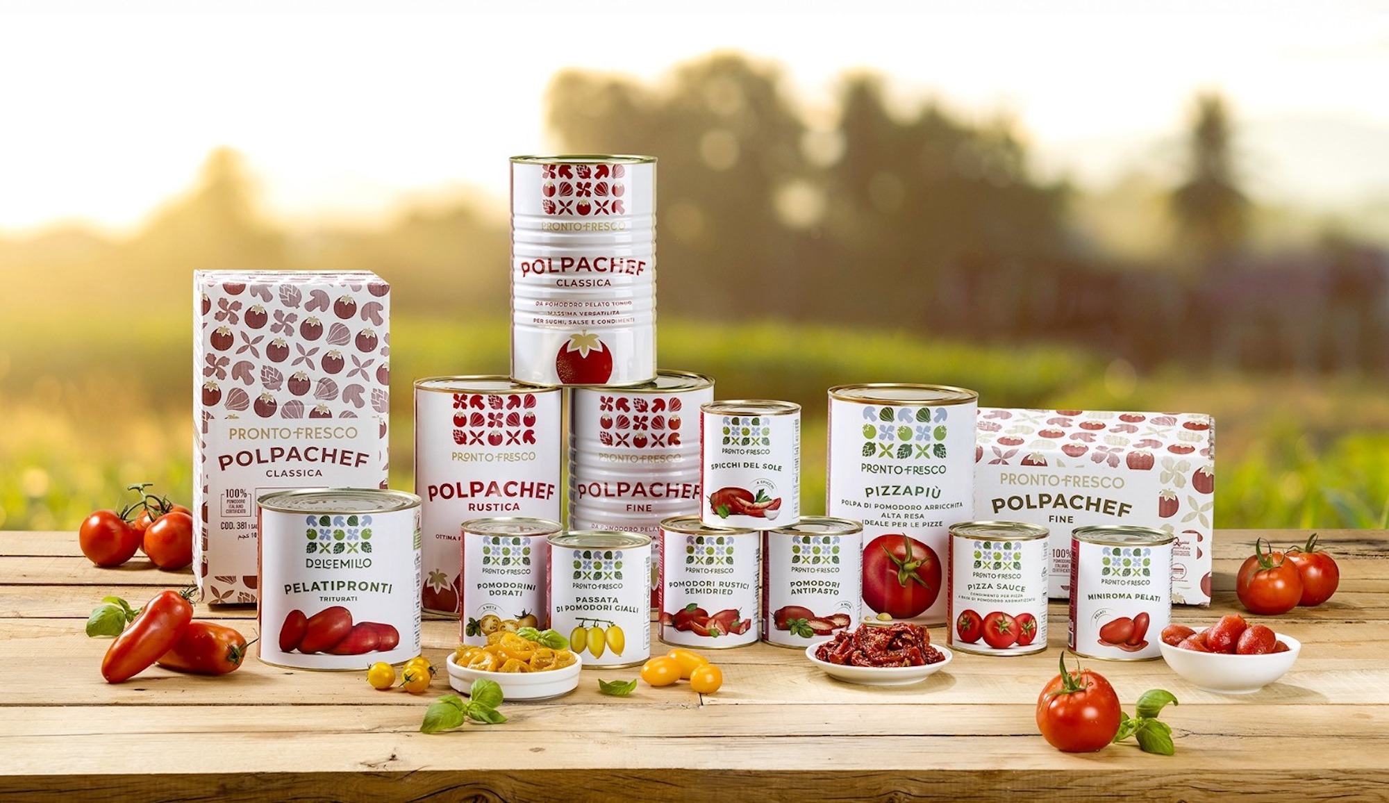
Brief: Greci, an Italian multinational company specializing in food production and marketing for the b2b market, is working on the reorganization of its sales system in order to make the characteristics of the different lines clearer and give more value to the individual product. For this it has become necessary to redefine brand, portfolio and packsystem architecture.
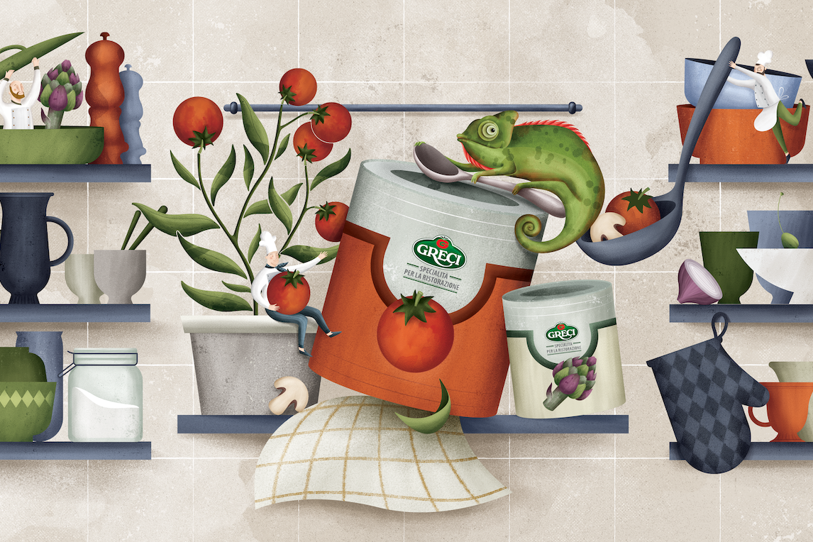
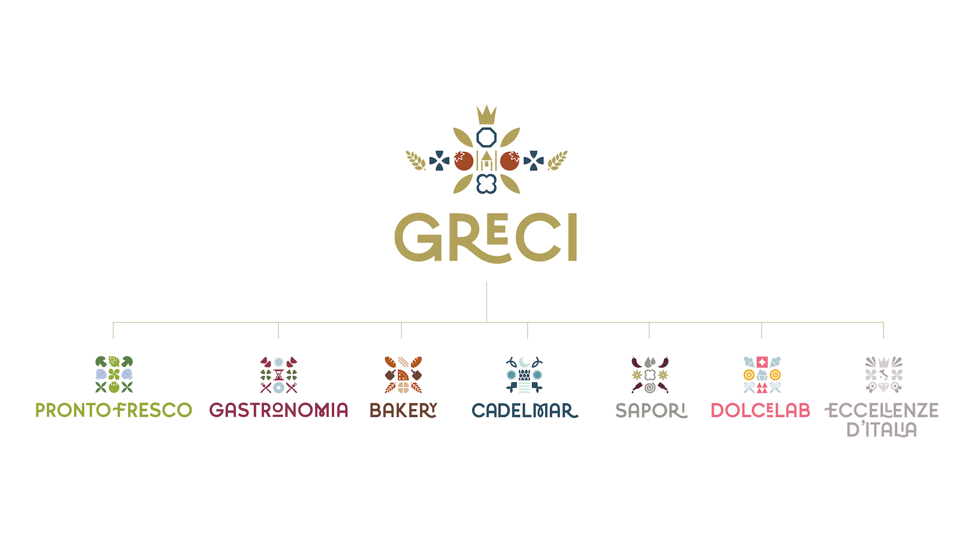
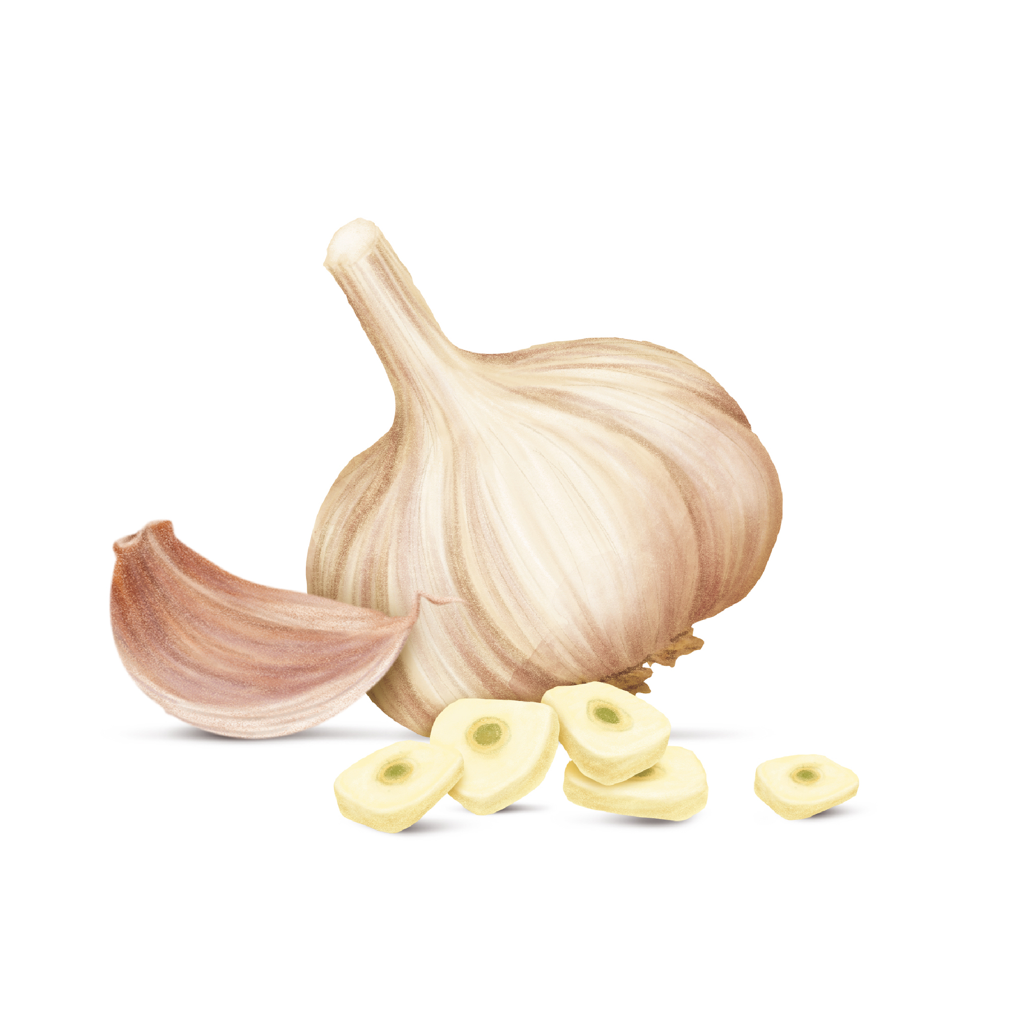
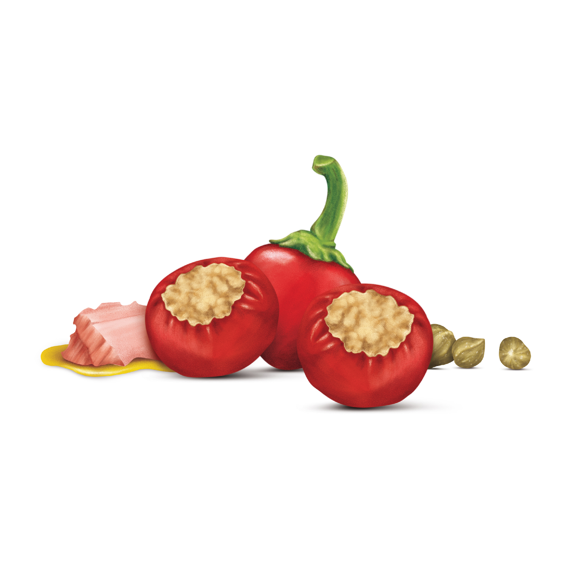
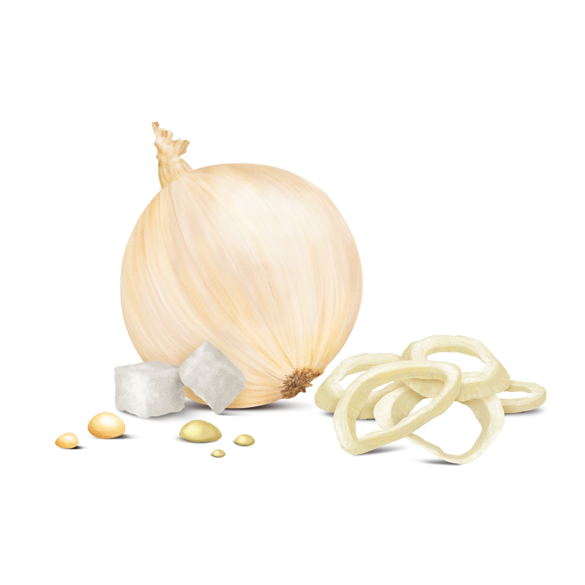
Work: we identified the need to develop a new dynamic identity that could more clearly communicate business and products, organized to create space for possible future product/business integrations. Once we established a clear and consistent hierarchy among the brands, we developed an elegant and extremely proprietary language, with that hint of “Romagna” in it that underscores the importance of the connection to the territory.
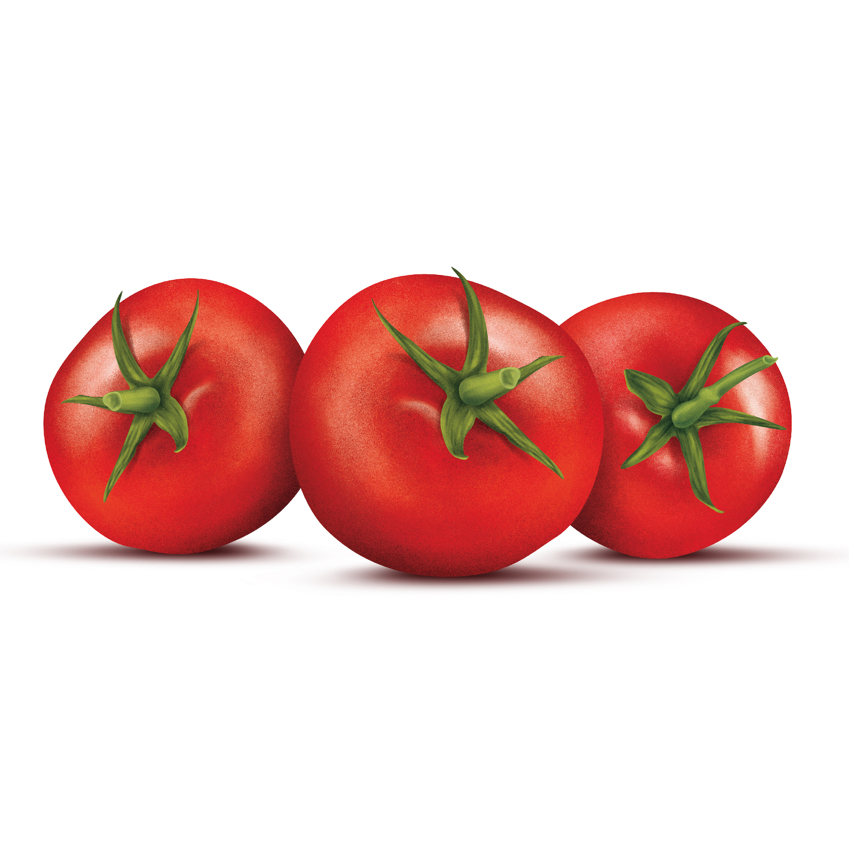
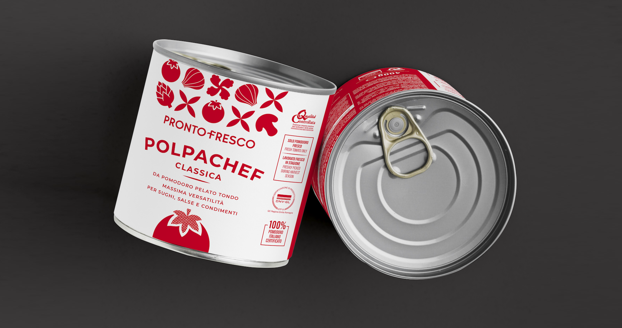
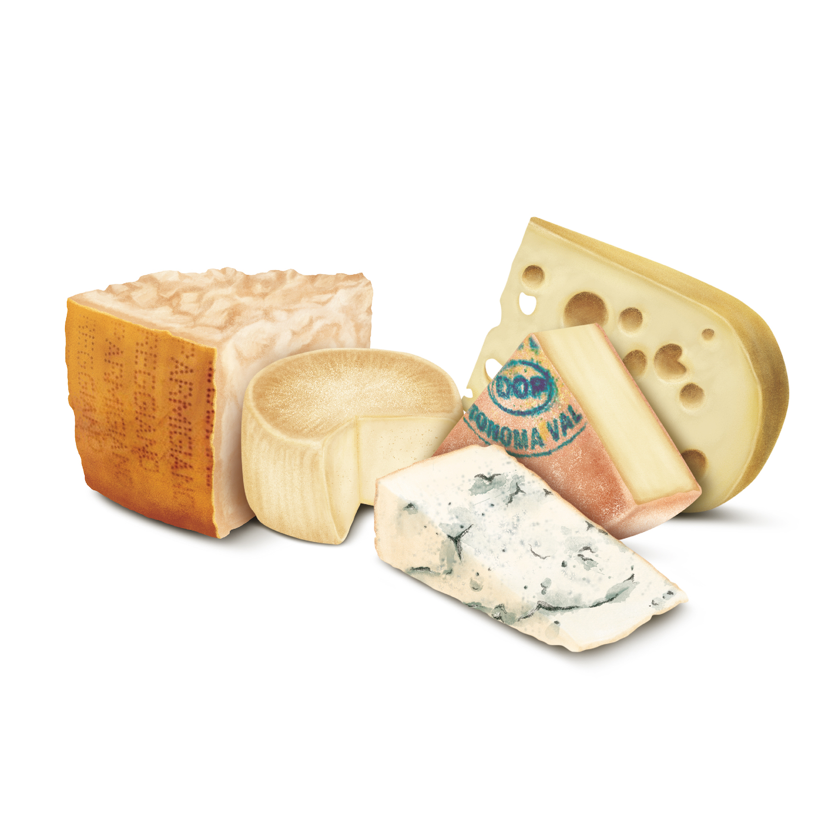
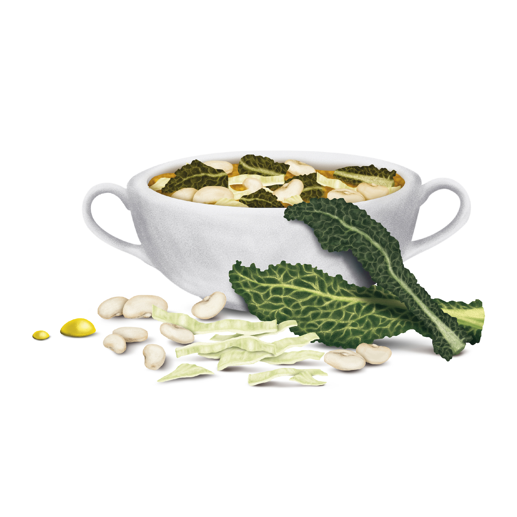
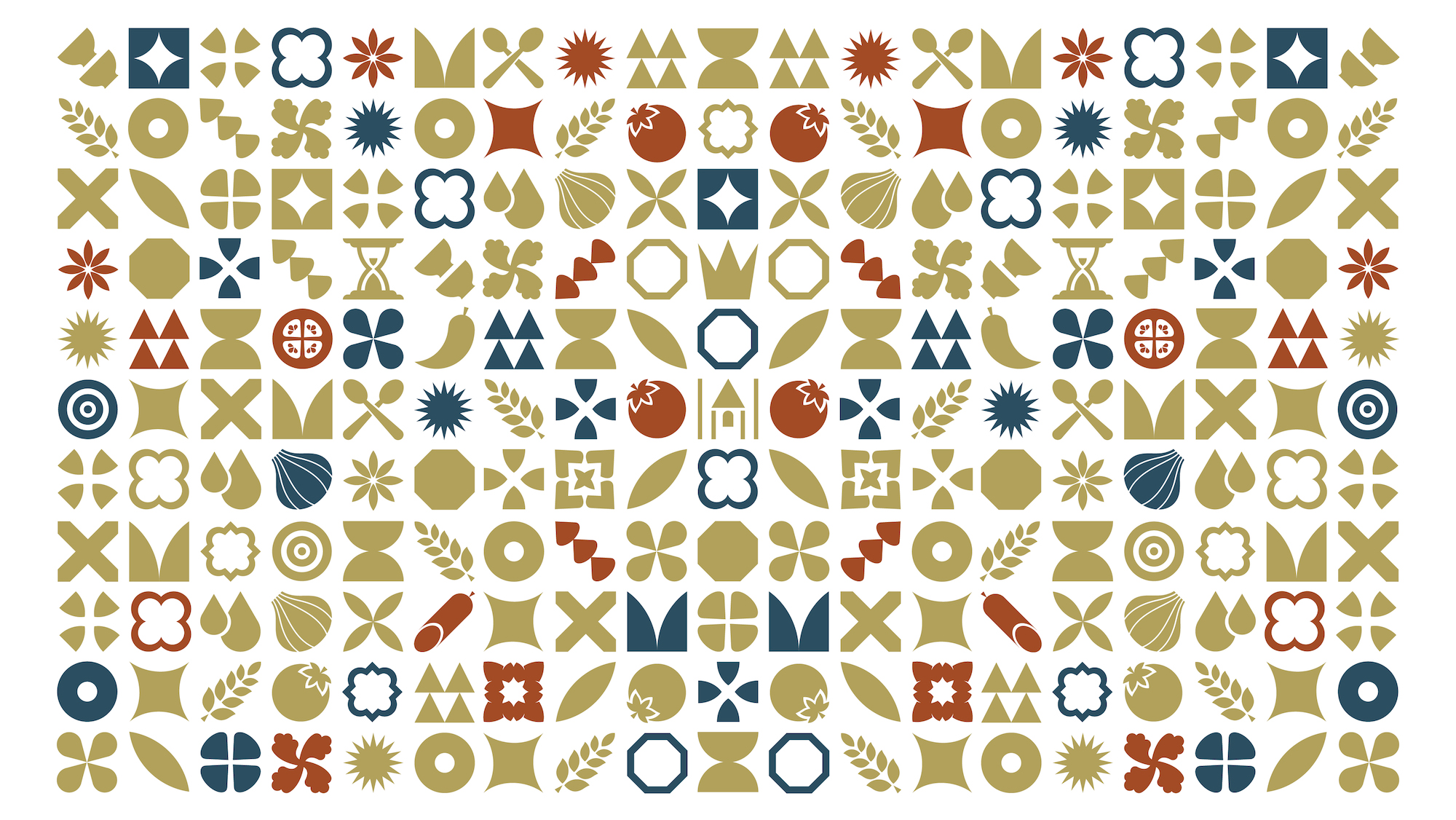
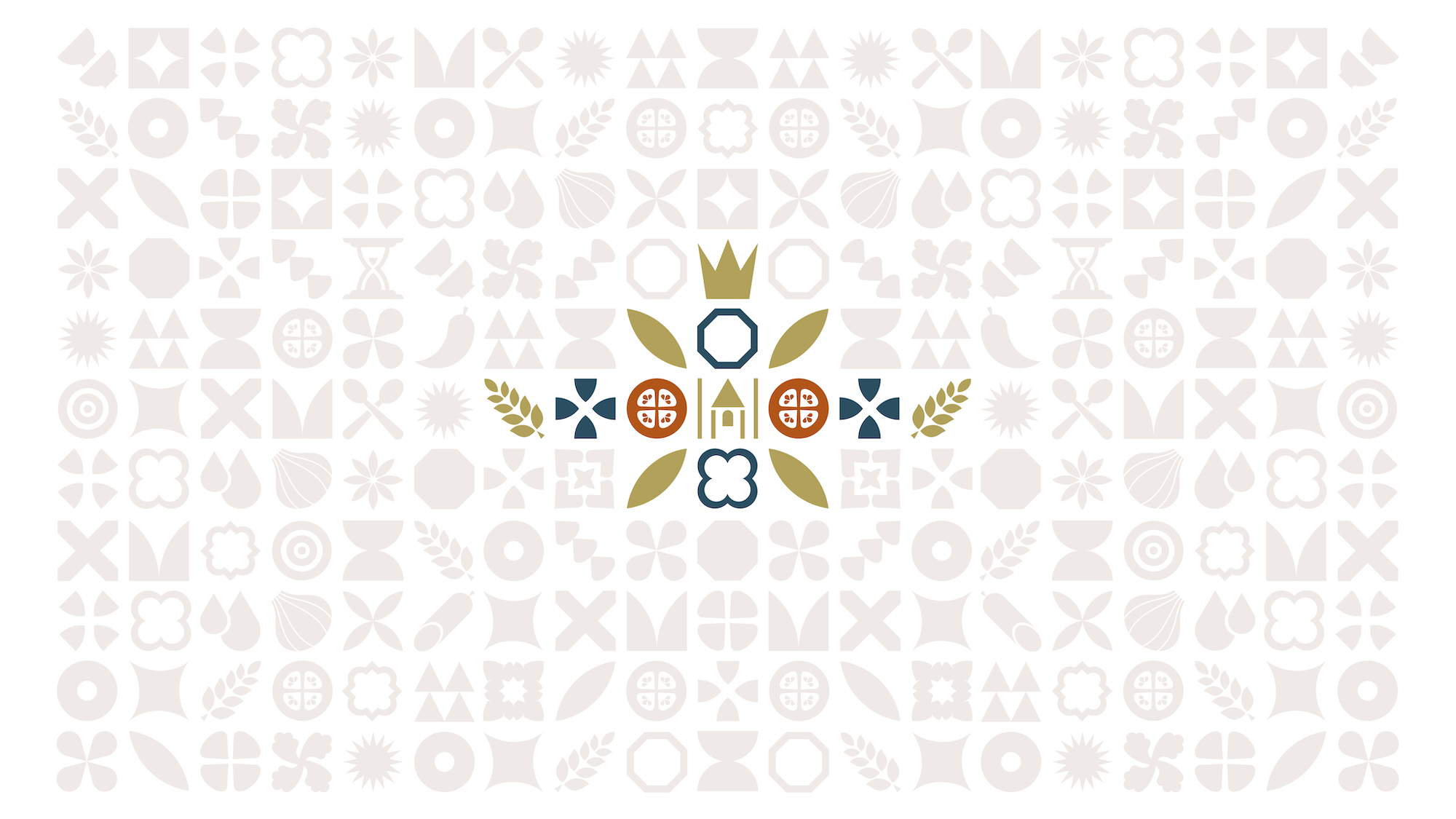
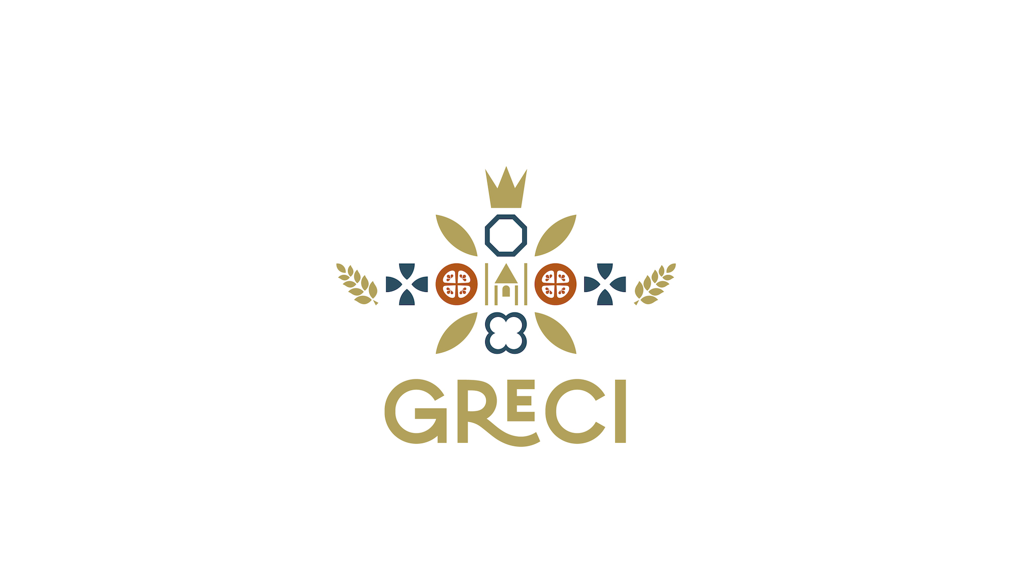
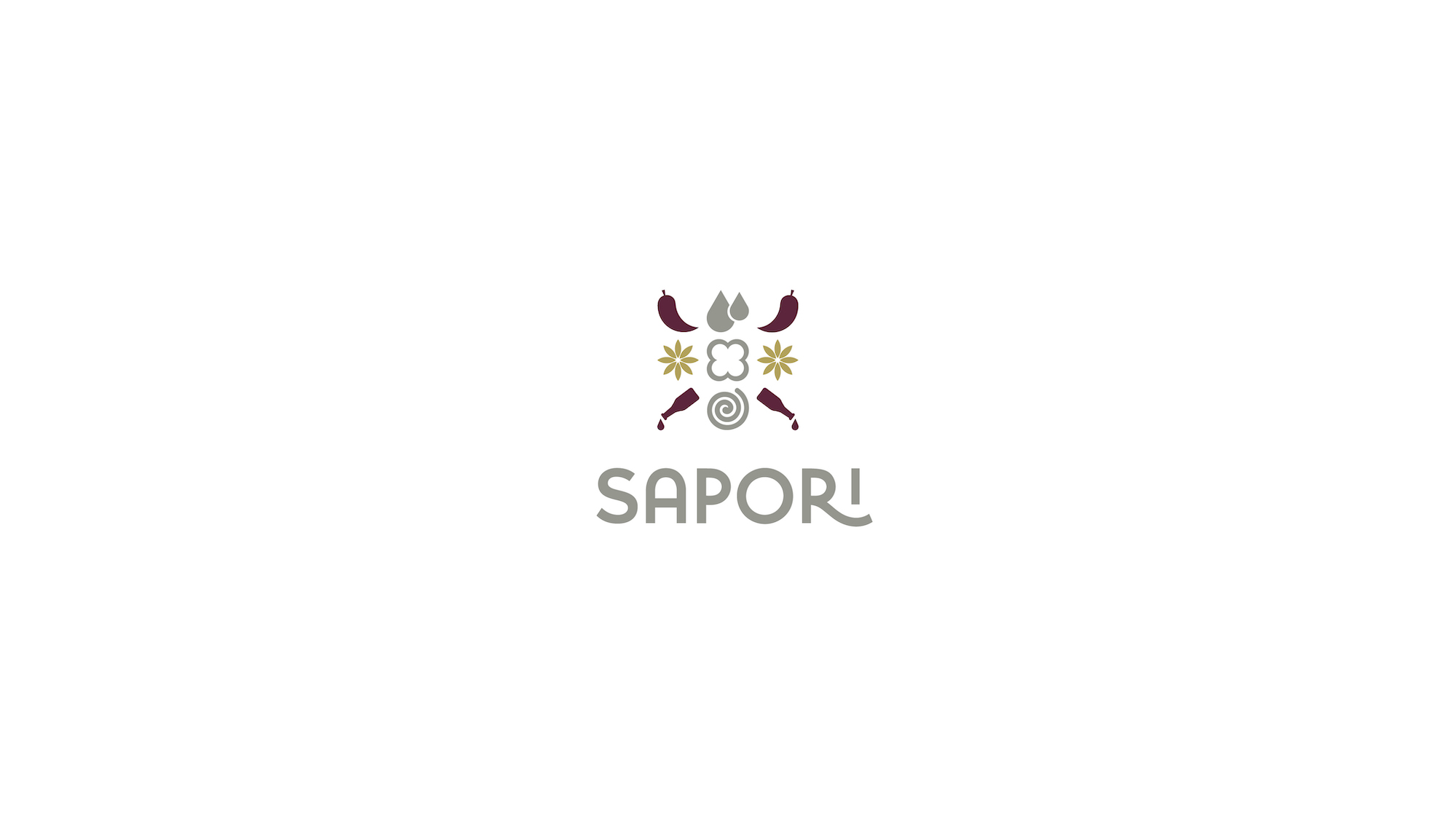
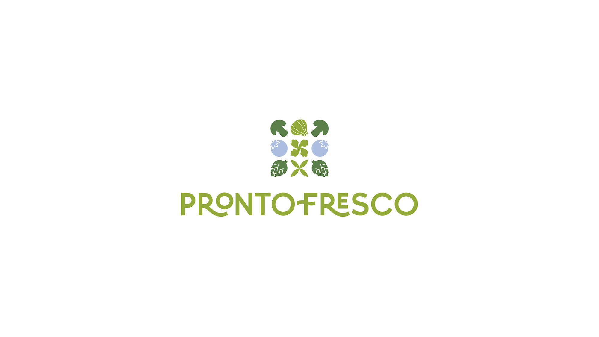
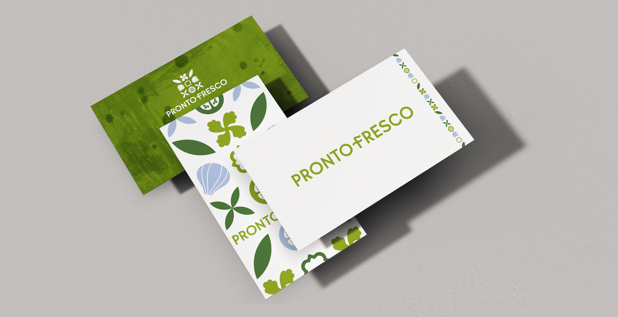
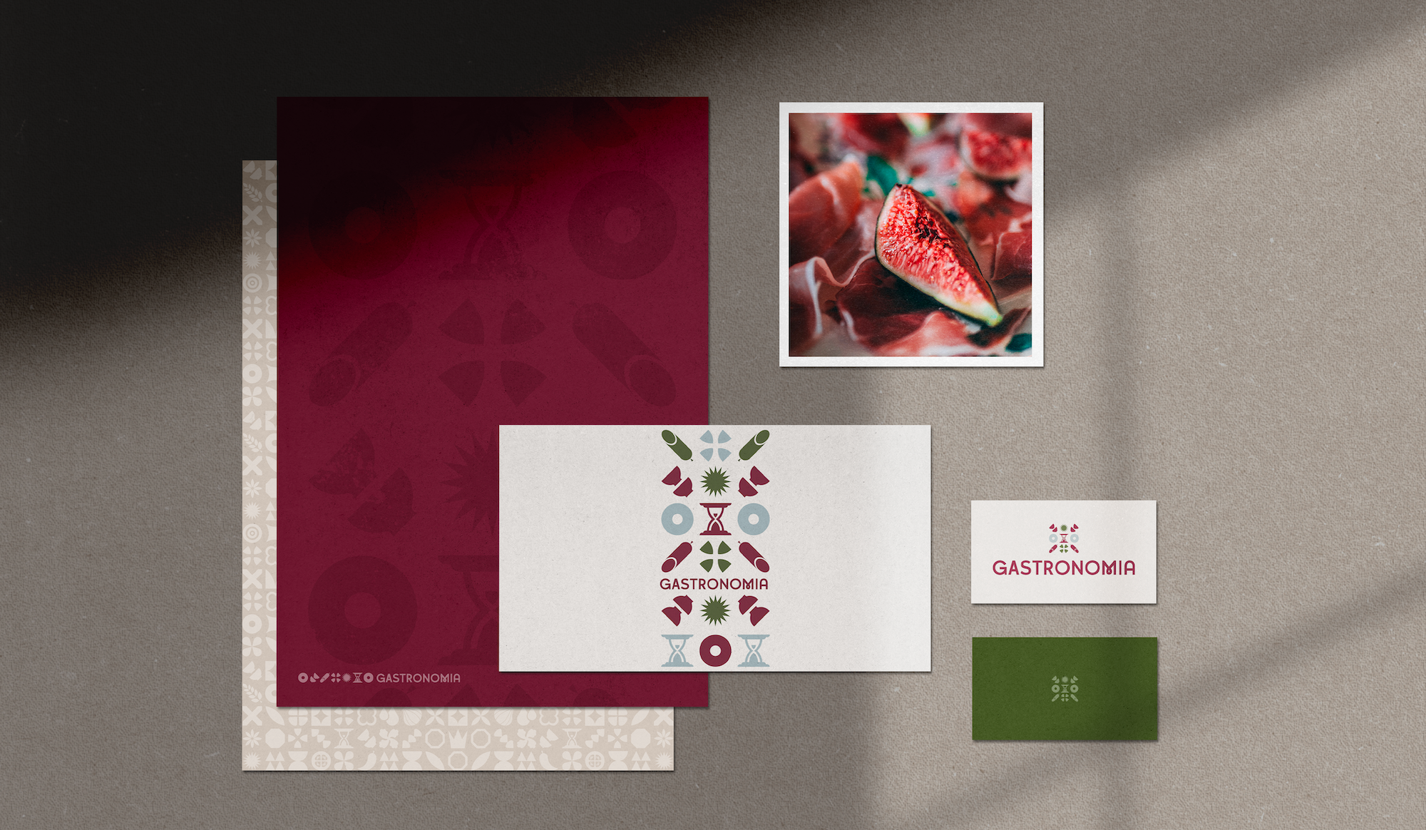
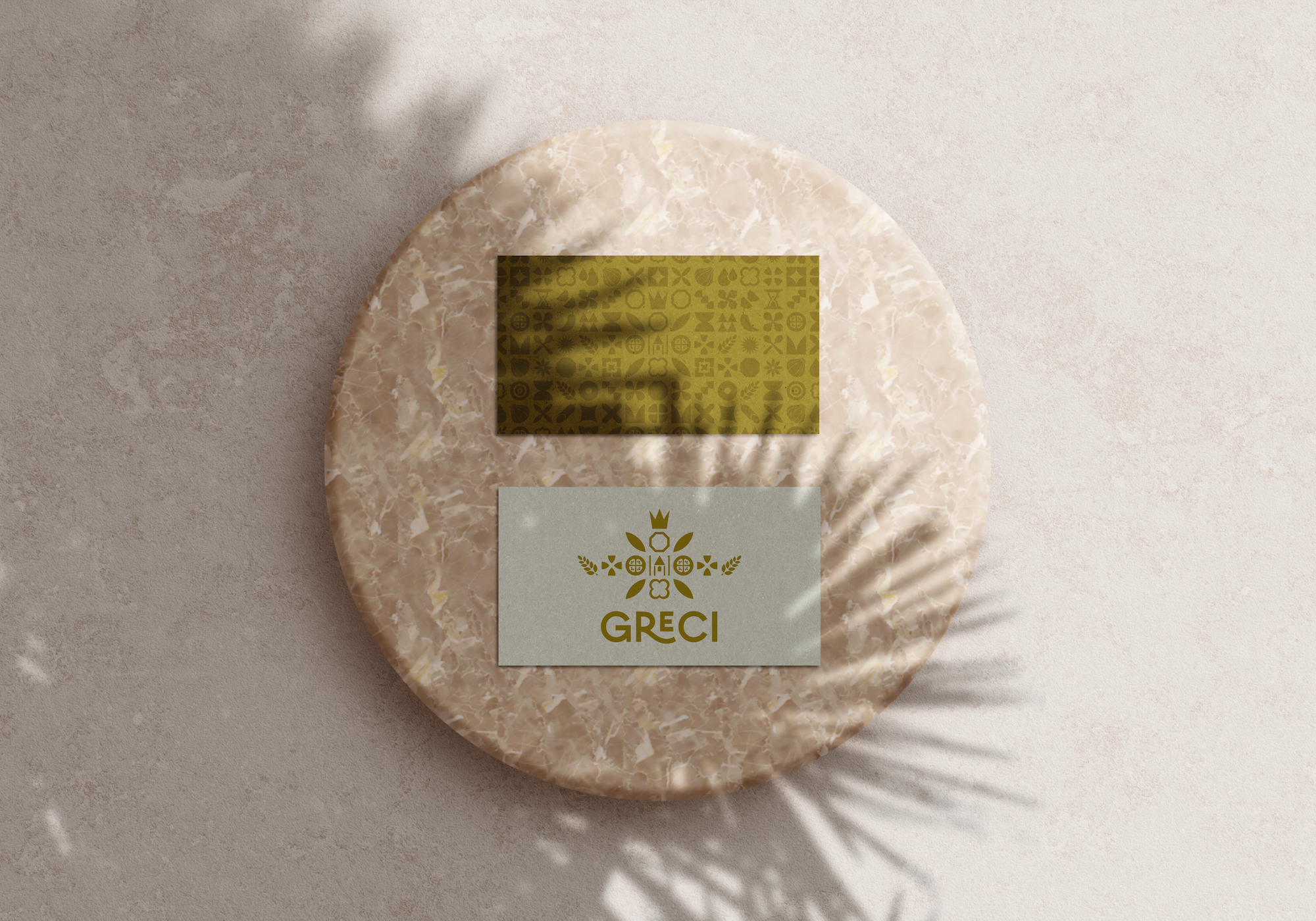
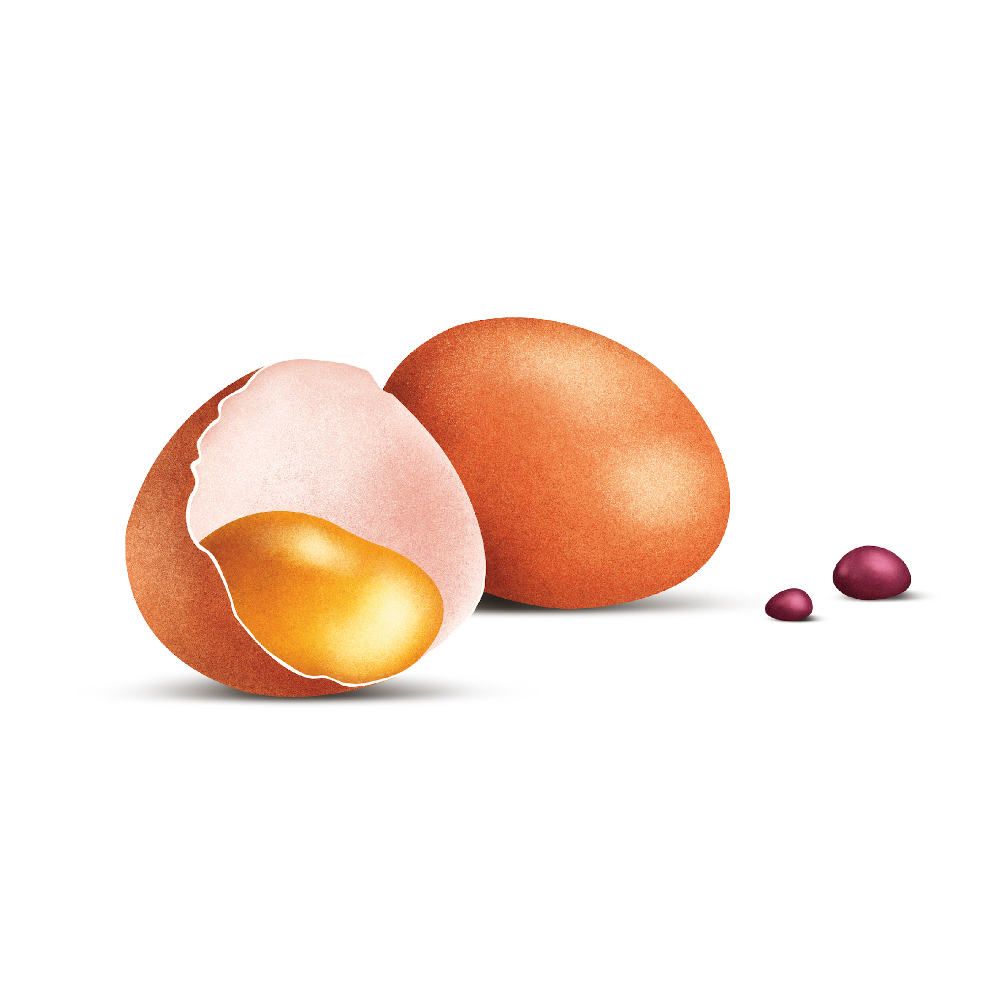
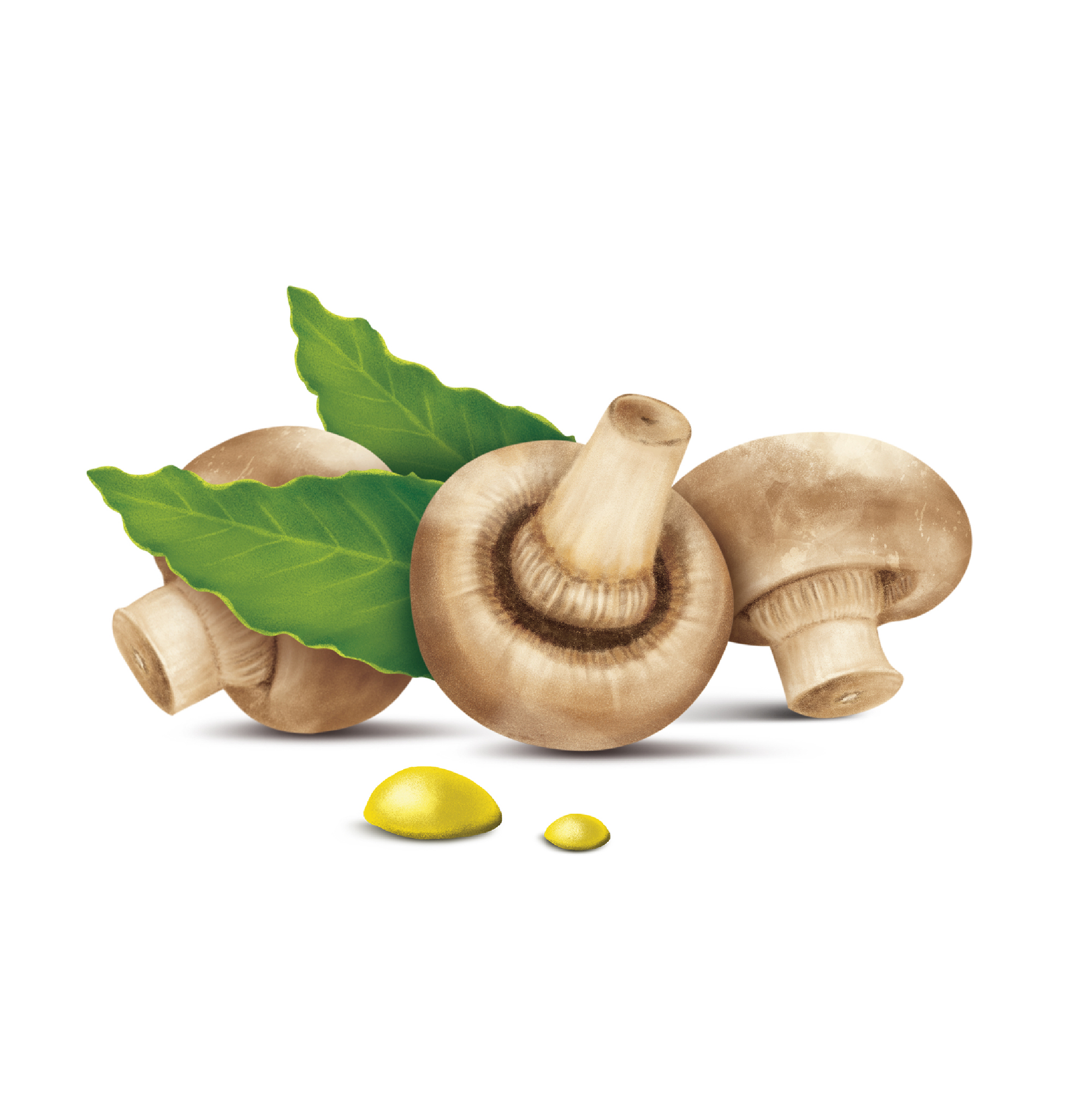
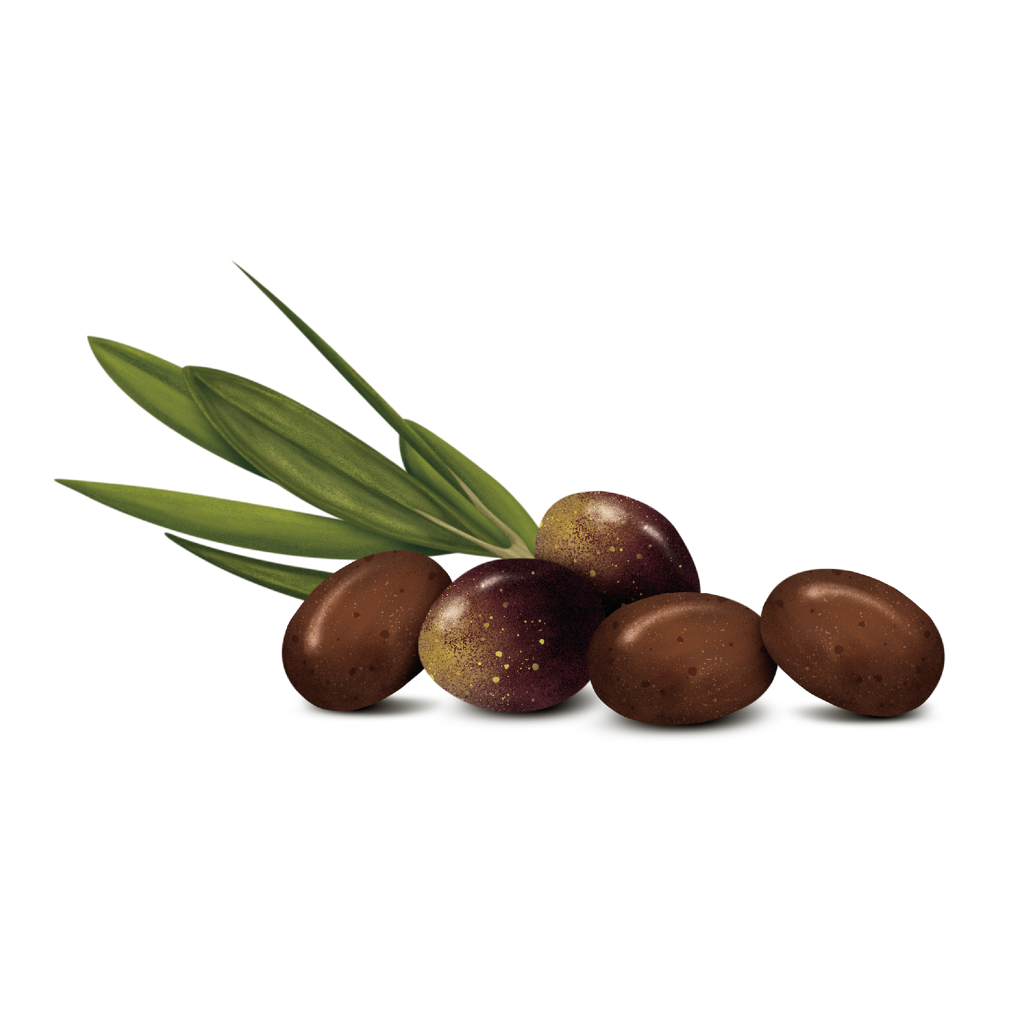
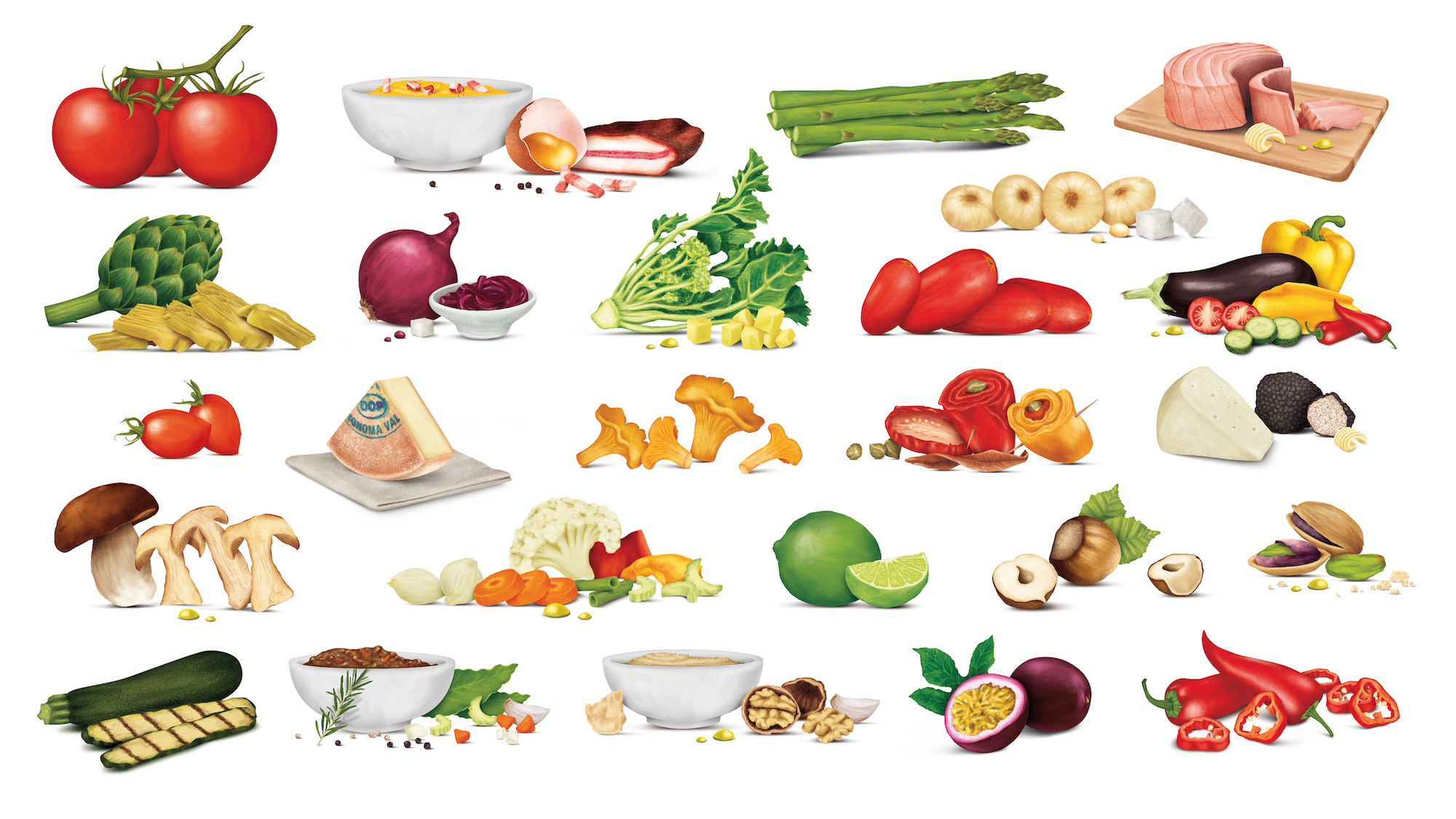
Outcome: drawing inspiration from the Ravenna mosaics, we developed proprietary symbols for each sub-brand, with such a color scheme and design that when, combined together, they form the mother brand’s identity, they best emphasize its strong internal connection. We developed all line master packs, proposing, in lieu of product shots, the production of ad hoc illustrations to represent the product. The design has been applied to all btl materials, catalogs, fair and exhibition layouts, and websites.
Total illustrations created (to date): 250.