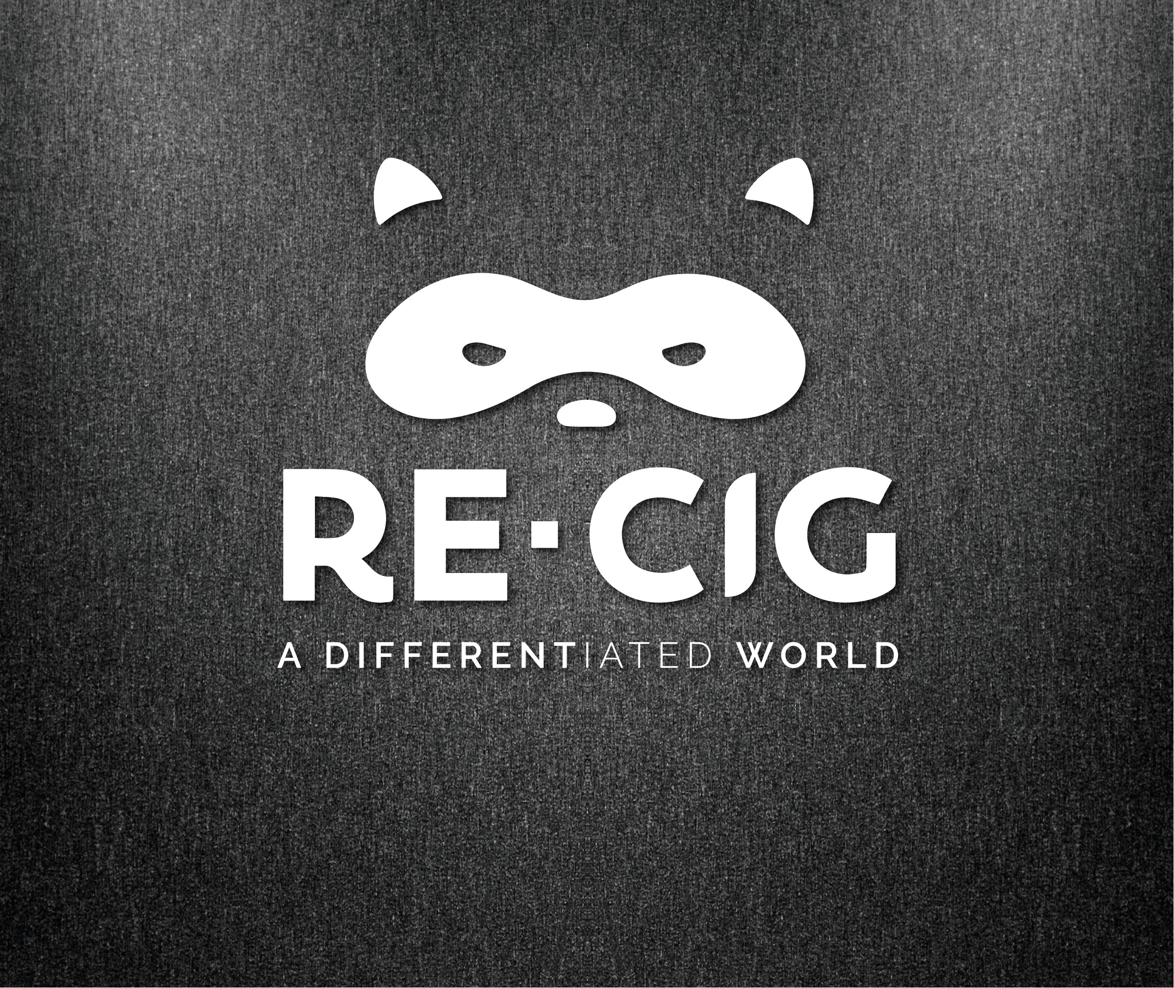
Be cautious and forward-looking like a raccoon, recycle like a pro.
Client
Re-Cig
Year
2020
Services
Brand Strategy
Design
Creative Direction
Link
Re-Think,Re-Use
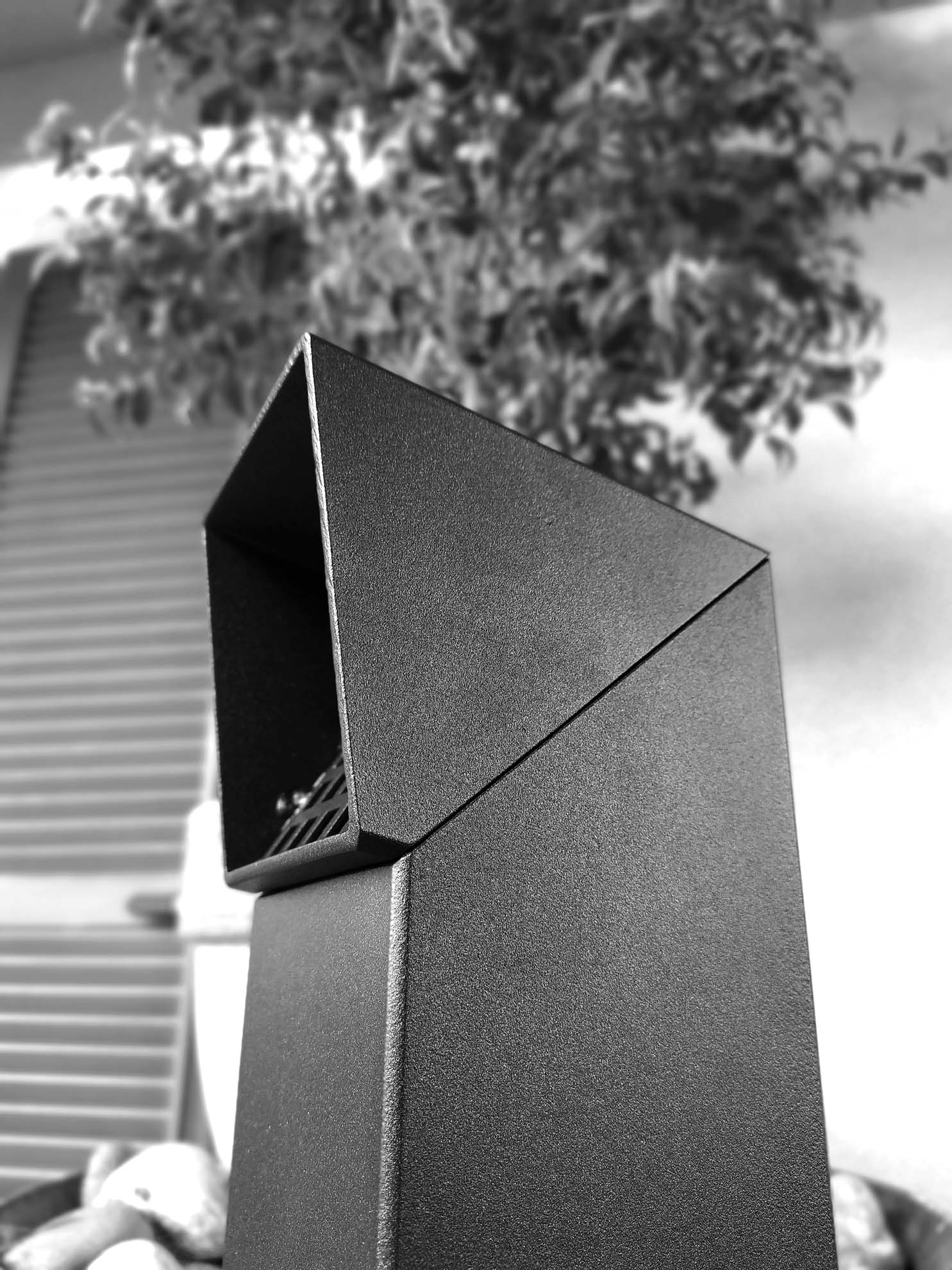
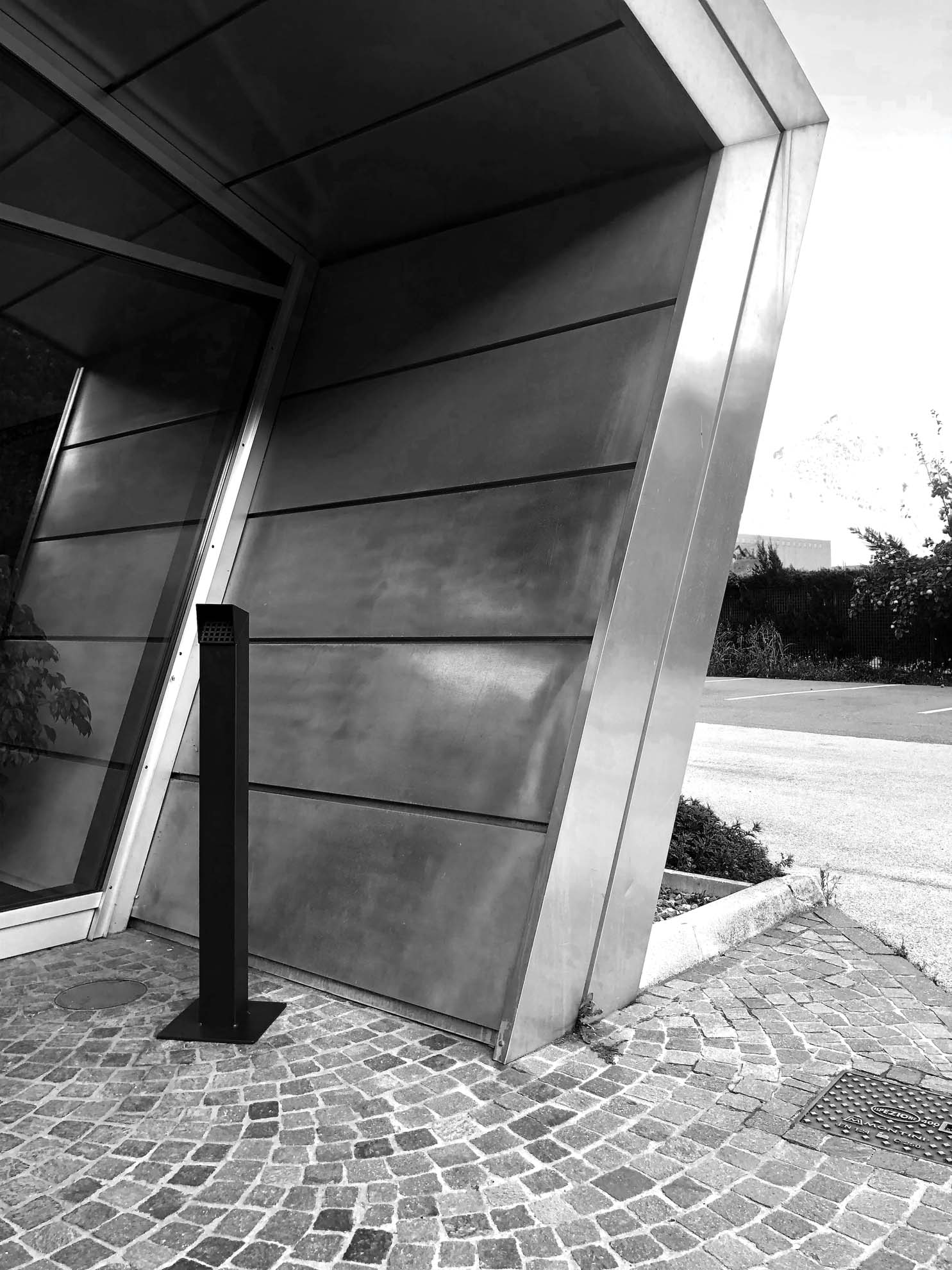
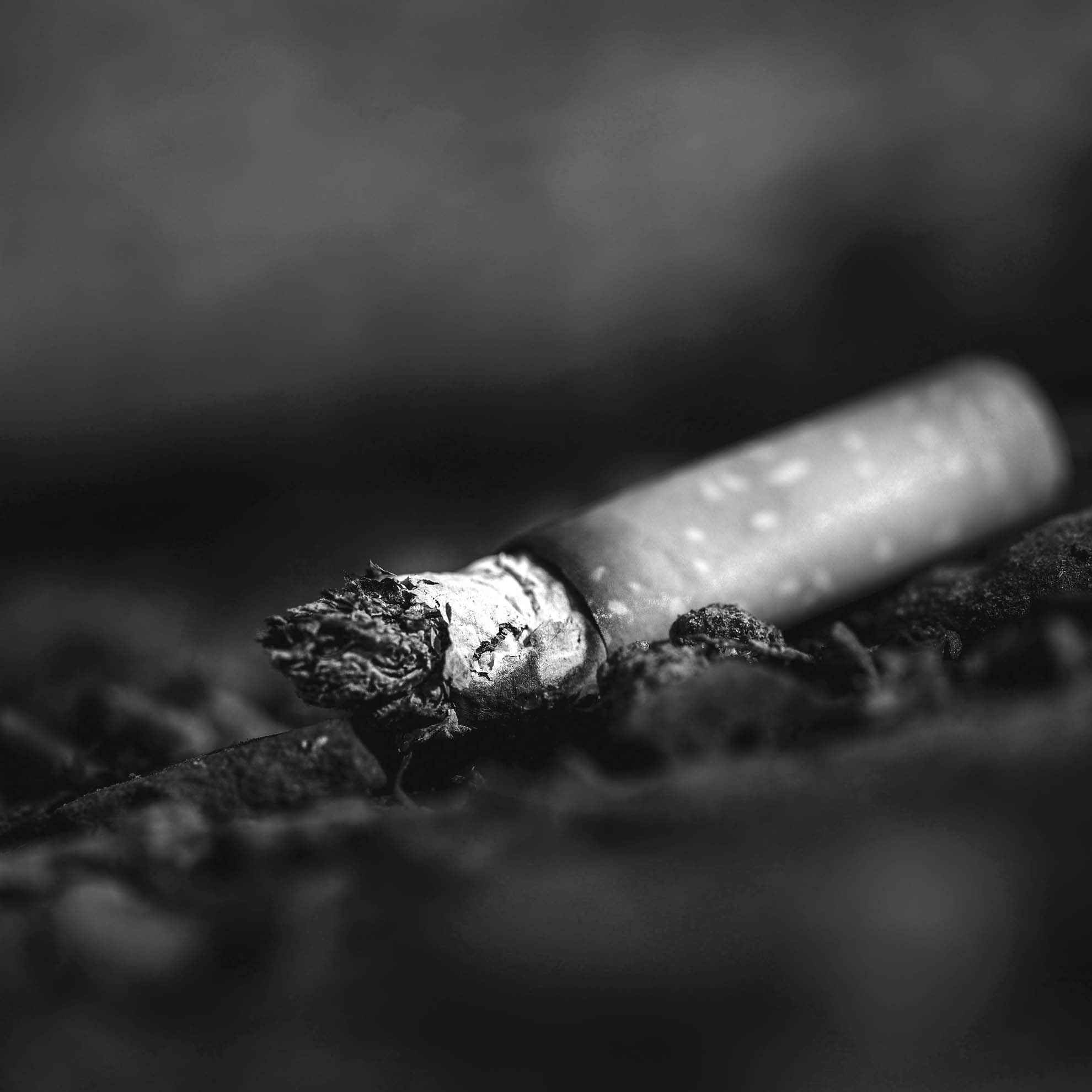
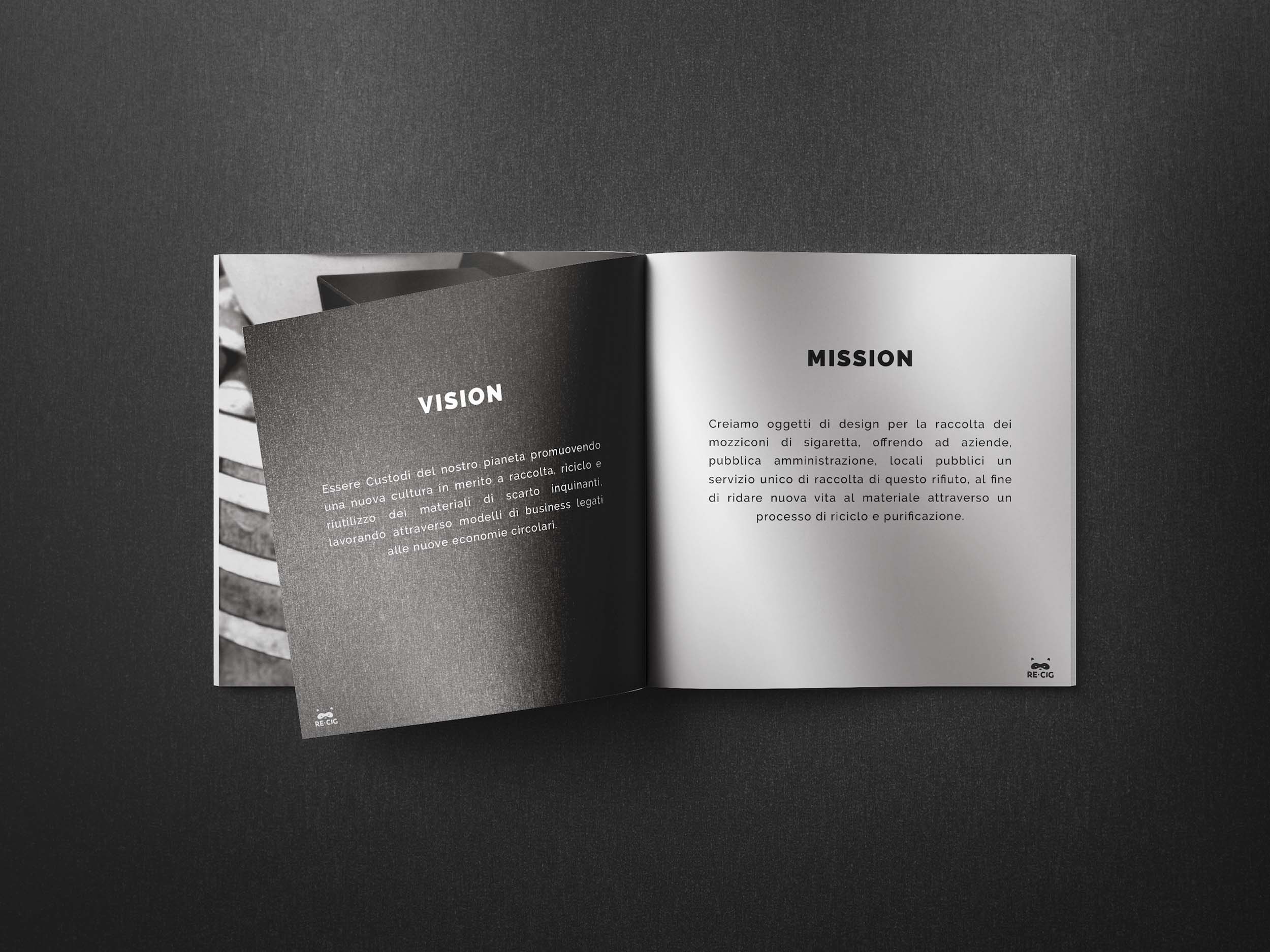
Brief: defining the visual identity of Re-cig, an innovative start-up, founded in 2016: the first Italian company that deals with the collection, management and recycling of “cigarette butt” waste.
Work: we identified the potential to be unlocked in the brand’s strong connection to the environment, so we constructed a language that would enhance it through a bolder and more engaging narrative of Re-cig‘s proposed recycling process.
Outcome: thus was born the logo with the iconic snout of the racoon, – the washing bear – which in addition to inspiring sympathy because of its mischievous “mask,” has the peculiar characteristic of washing food before eating it.
An action reminiscent of the first step in the recycling process proposed by re-cig: washing cigarette butts.
The racoon is the engaging, original and distinctive element of the brochure created for commercial support.