More than a century of love and passion for the land and wine.
Client:
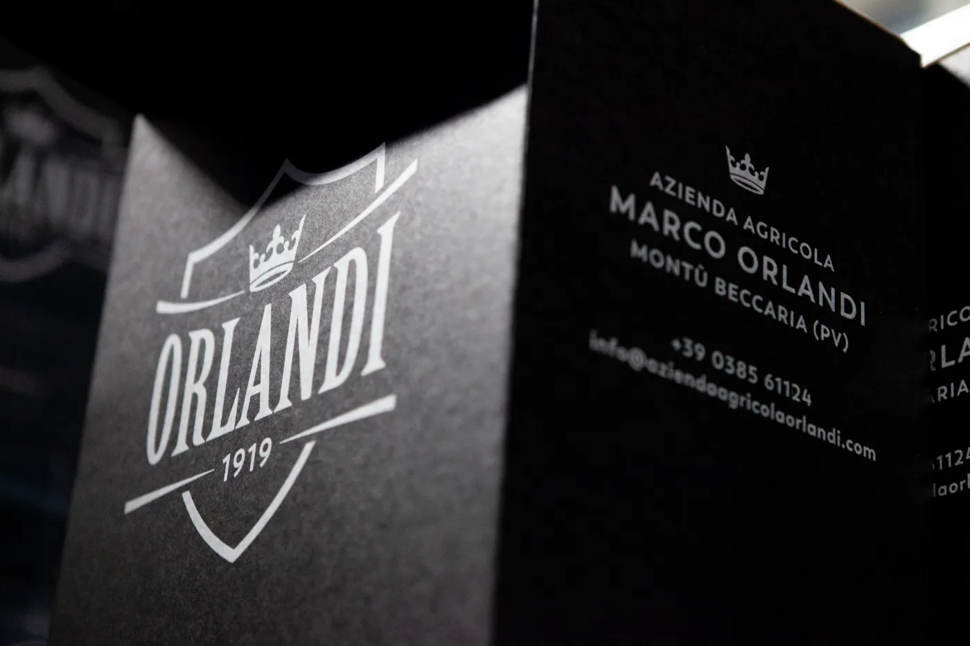
Azienda Agricola Marco Orlandi
Year
2025
Services
Branding
Design
Creative Direction
Country
Italy


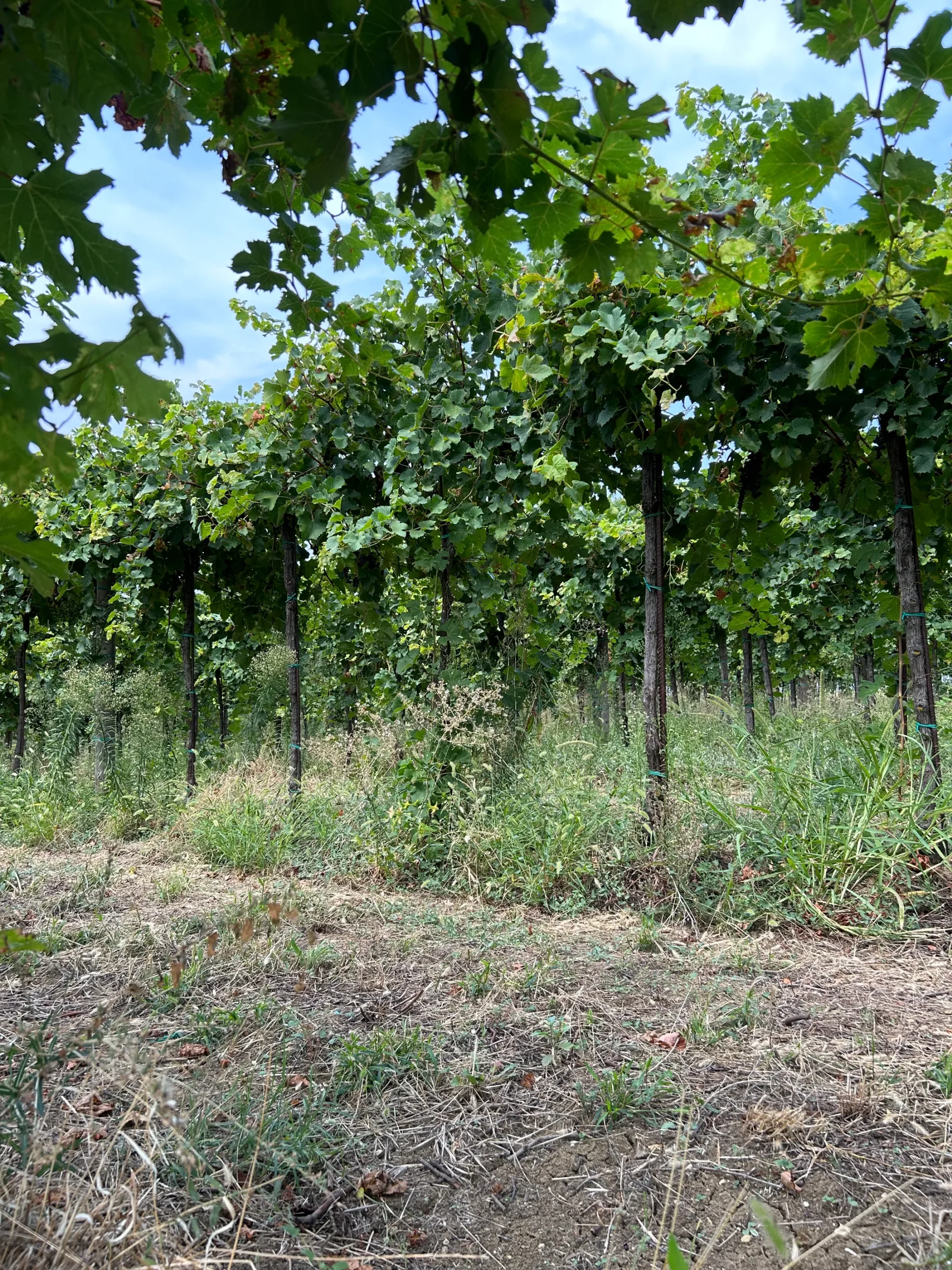
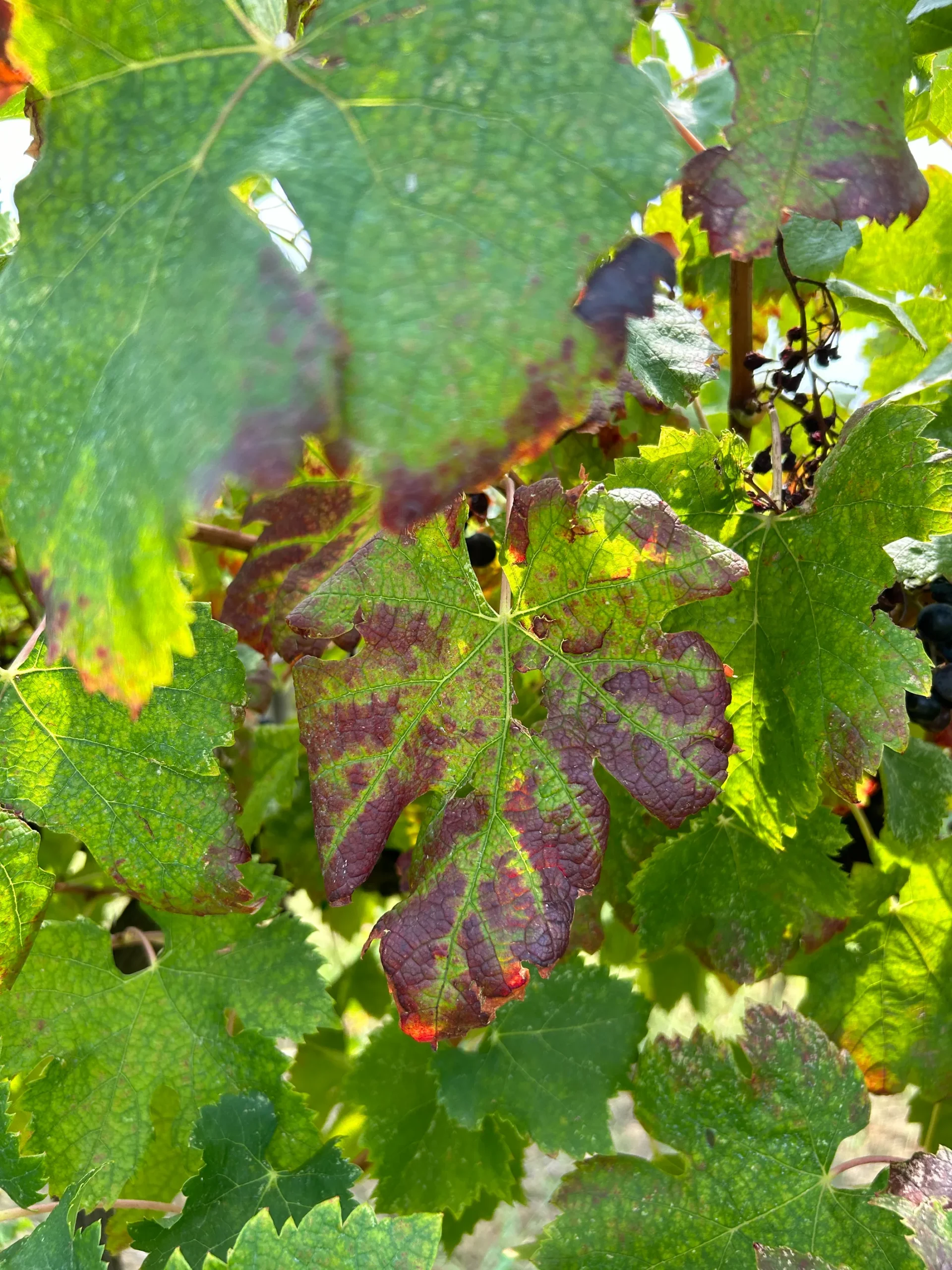
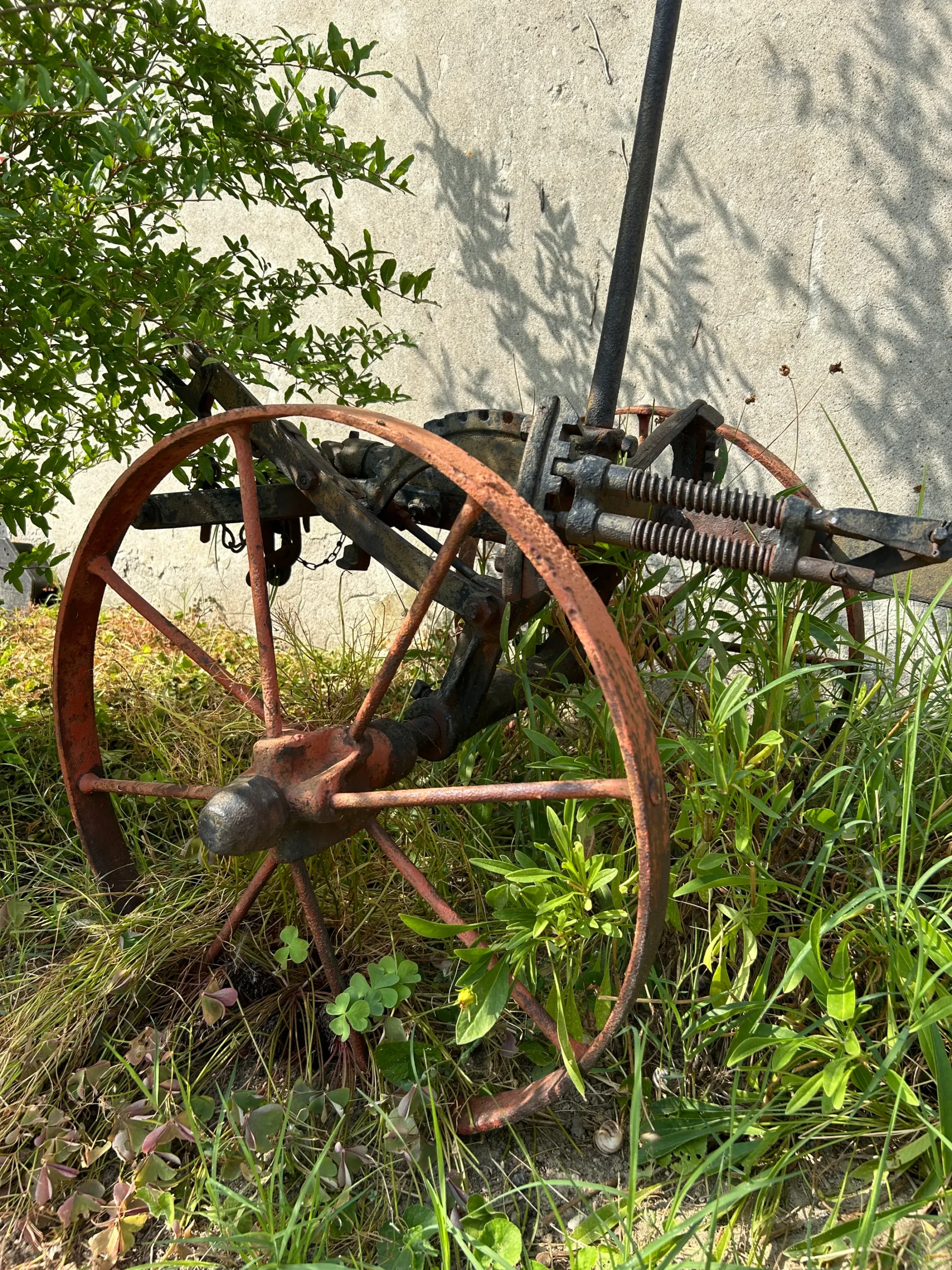
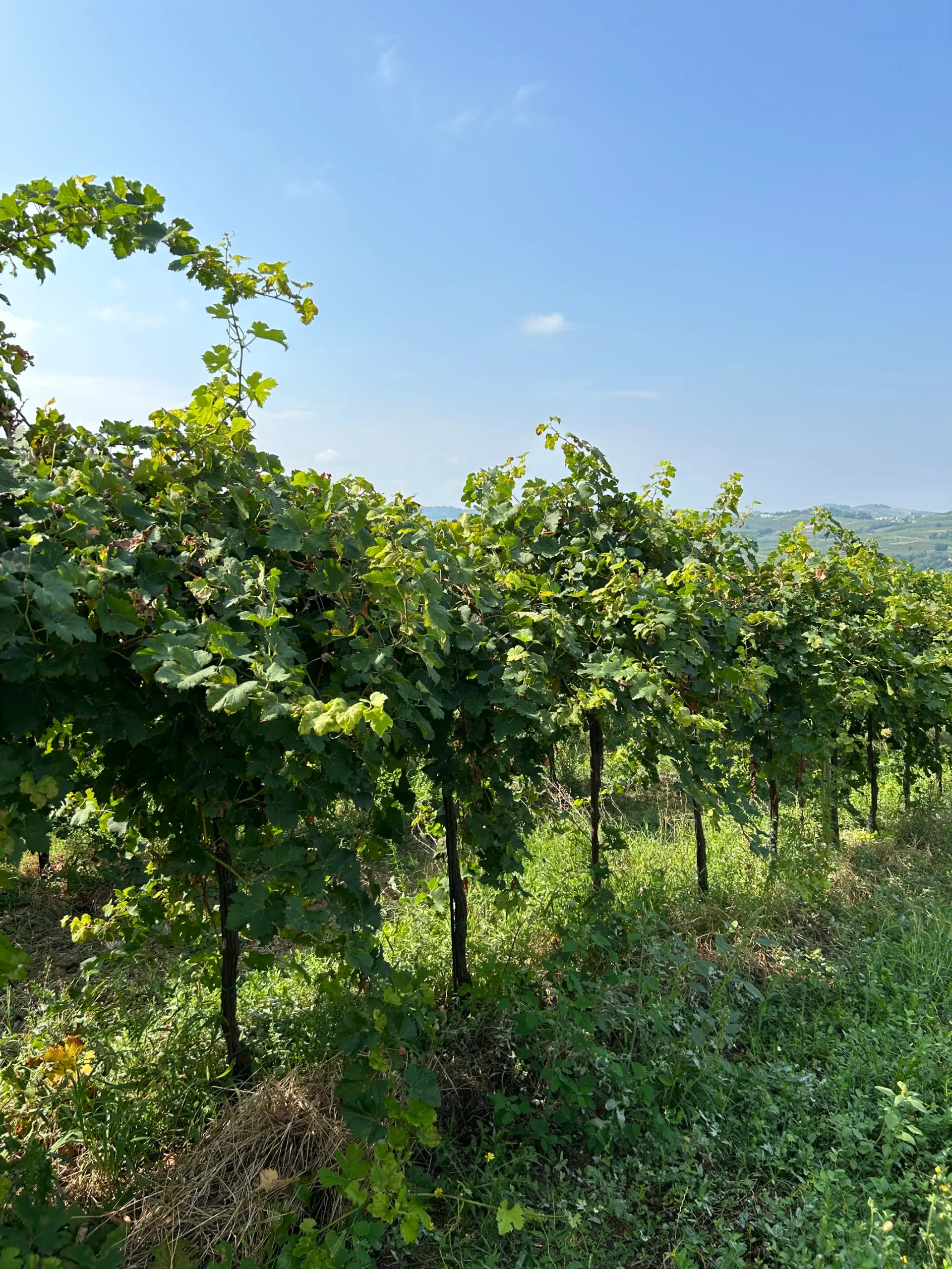
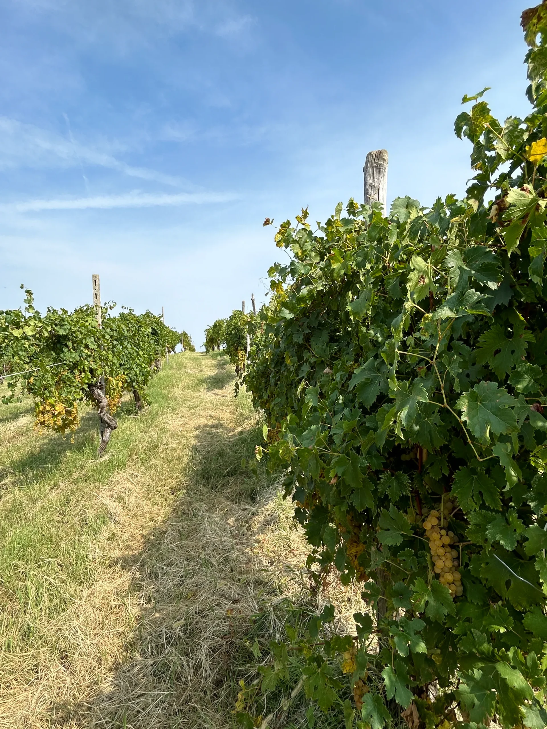
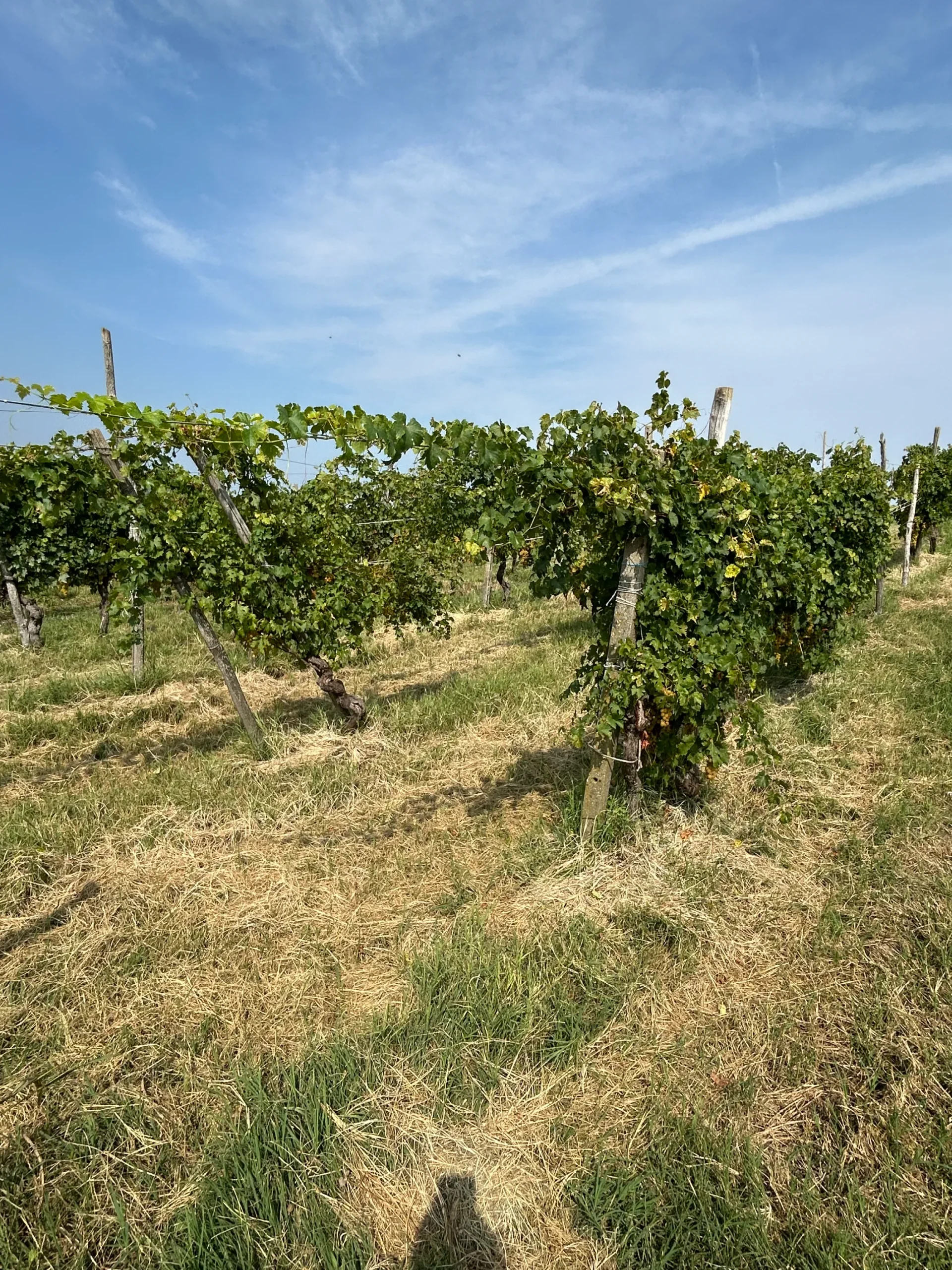
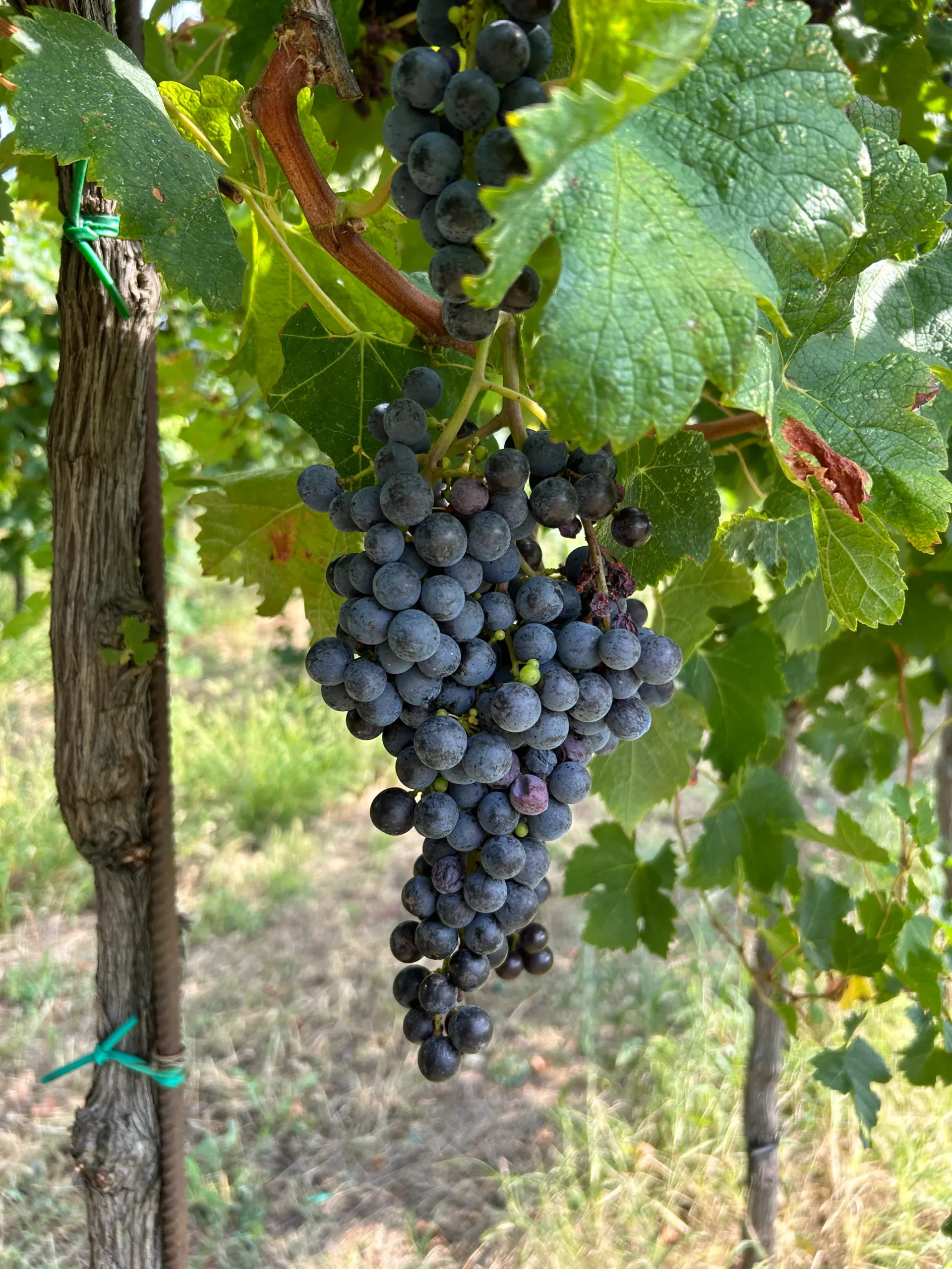
Brief: Azienda Agricola Orlandi is one of the most historic wineries in the Oltrepò Pavese region. Founded in 1919 by Attilio Orlandi, it is now a fourth-generation family business with a wide-ranging product portfolio.
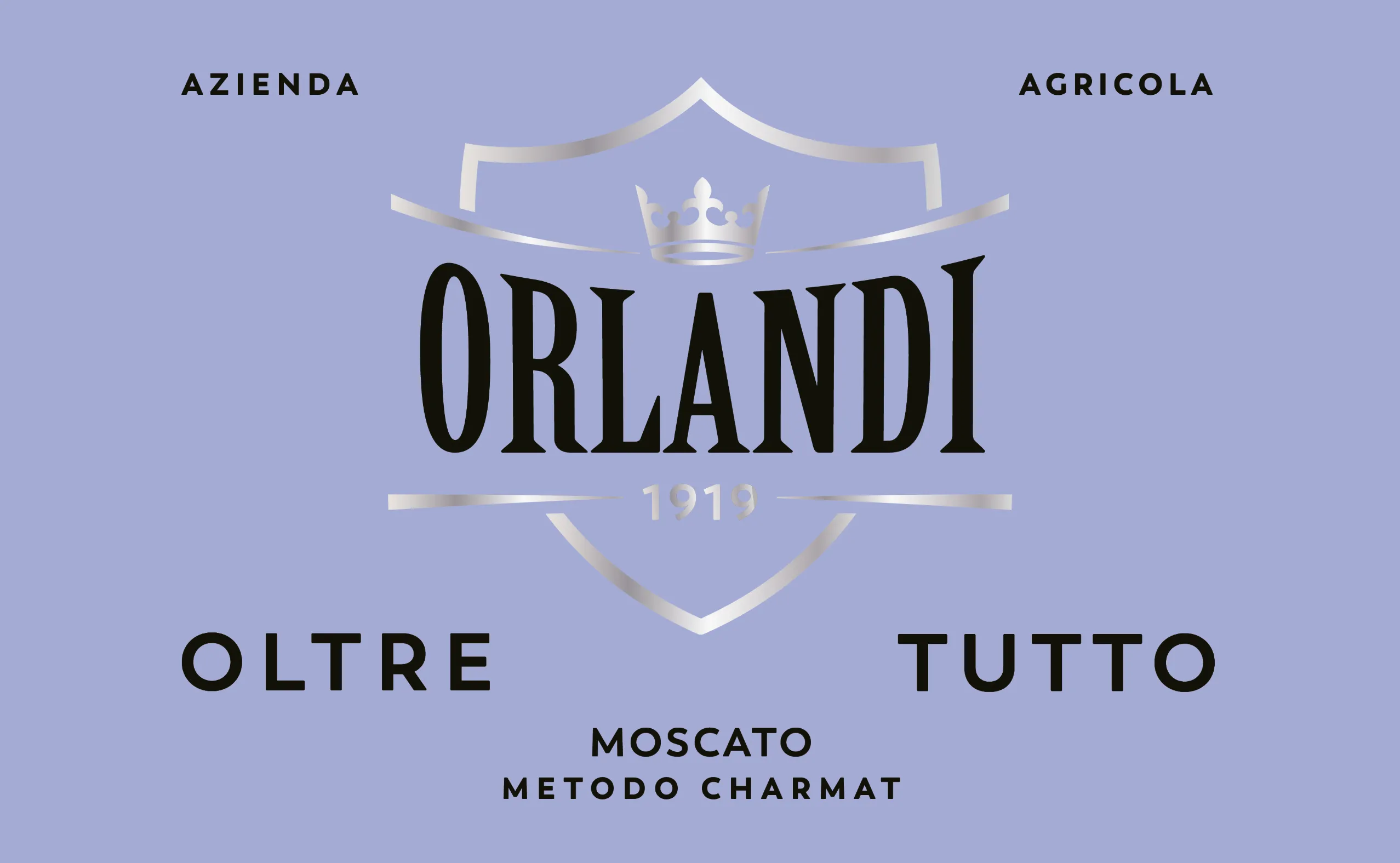
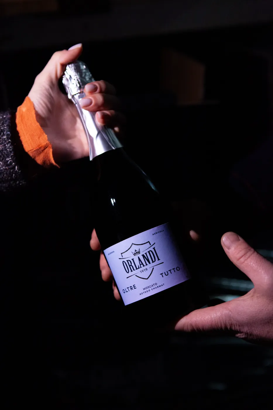
The immediate need was to redesign the label for Oltretutto in order to enter the Milan market with greater impact and clarity.
Work: To meet the underlying need for a broader evolution of the brand identity, we focused on repositioning and elevating the Azienda Agricola Orlandi brand.
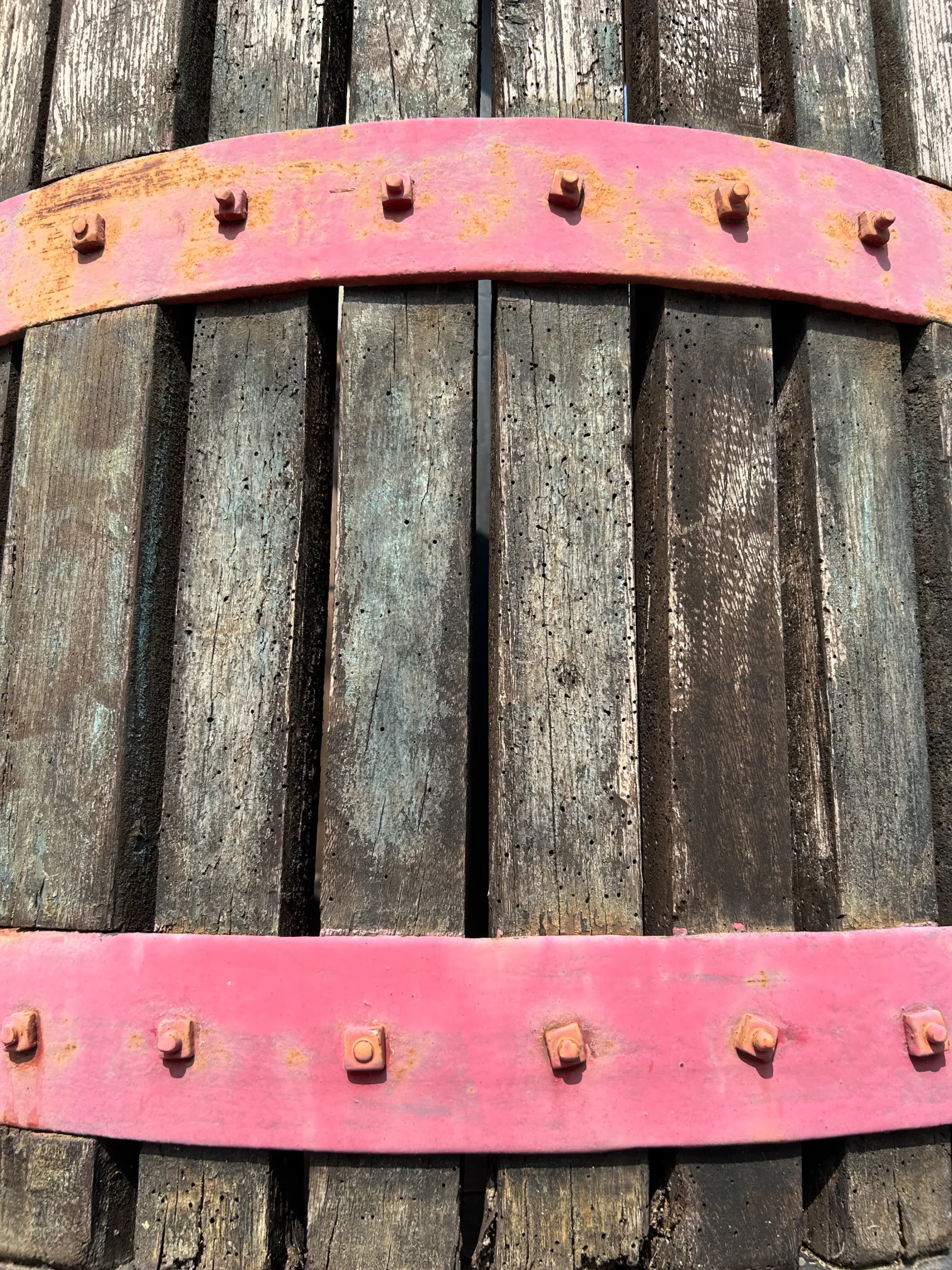
Our strategy centered on enhancing the company’s legacy, amplifying its deep roots in the territory while also celebrating its modern, visionary management.
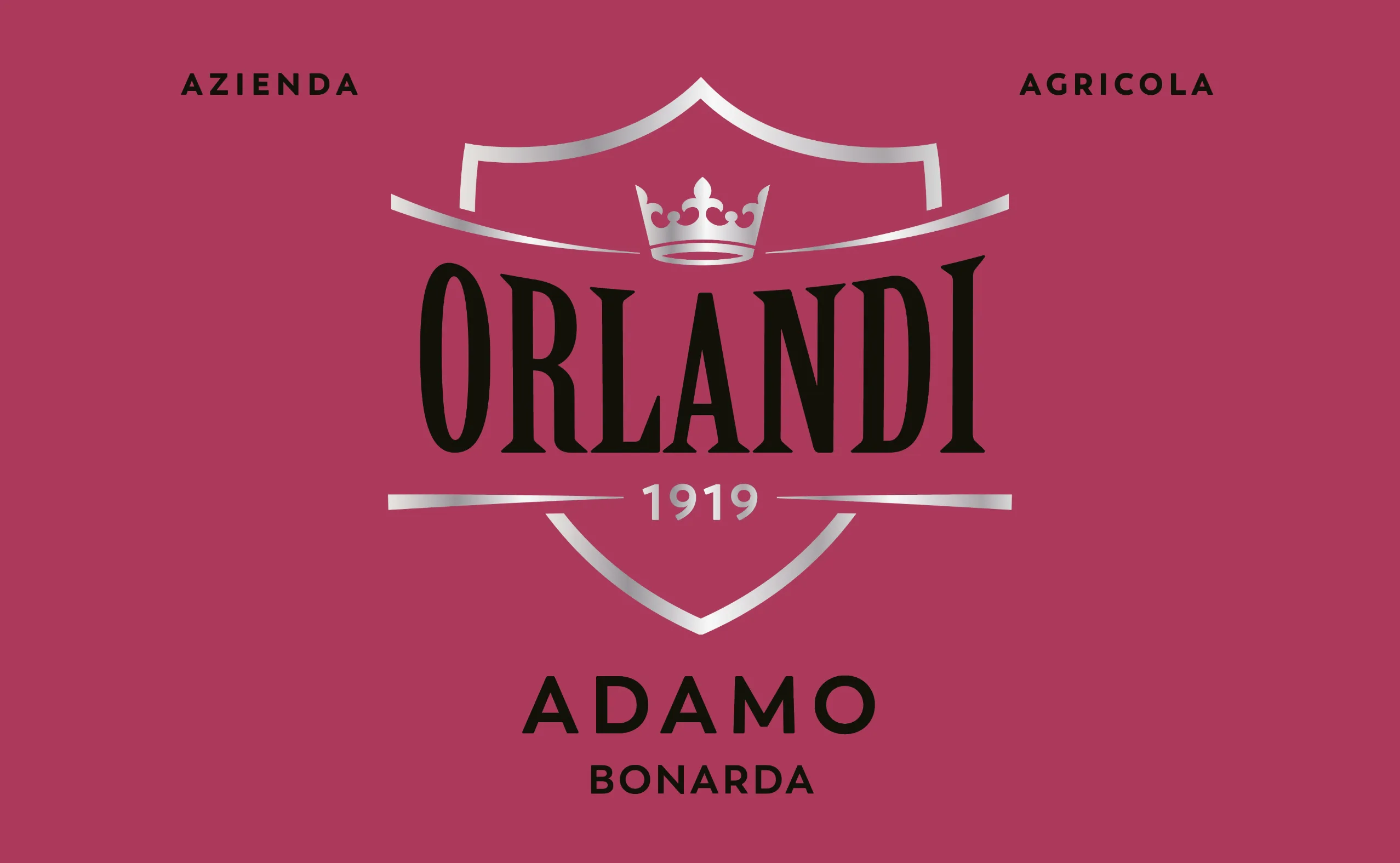
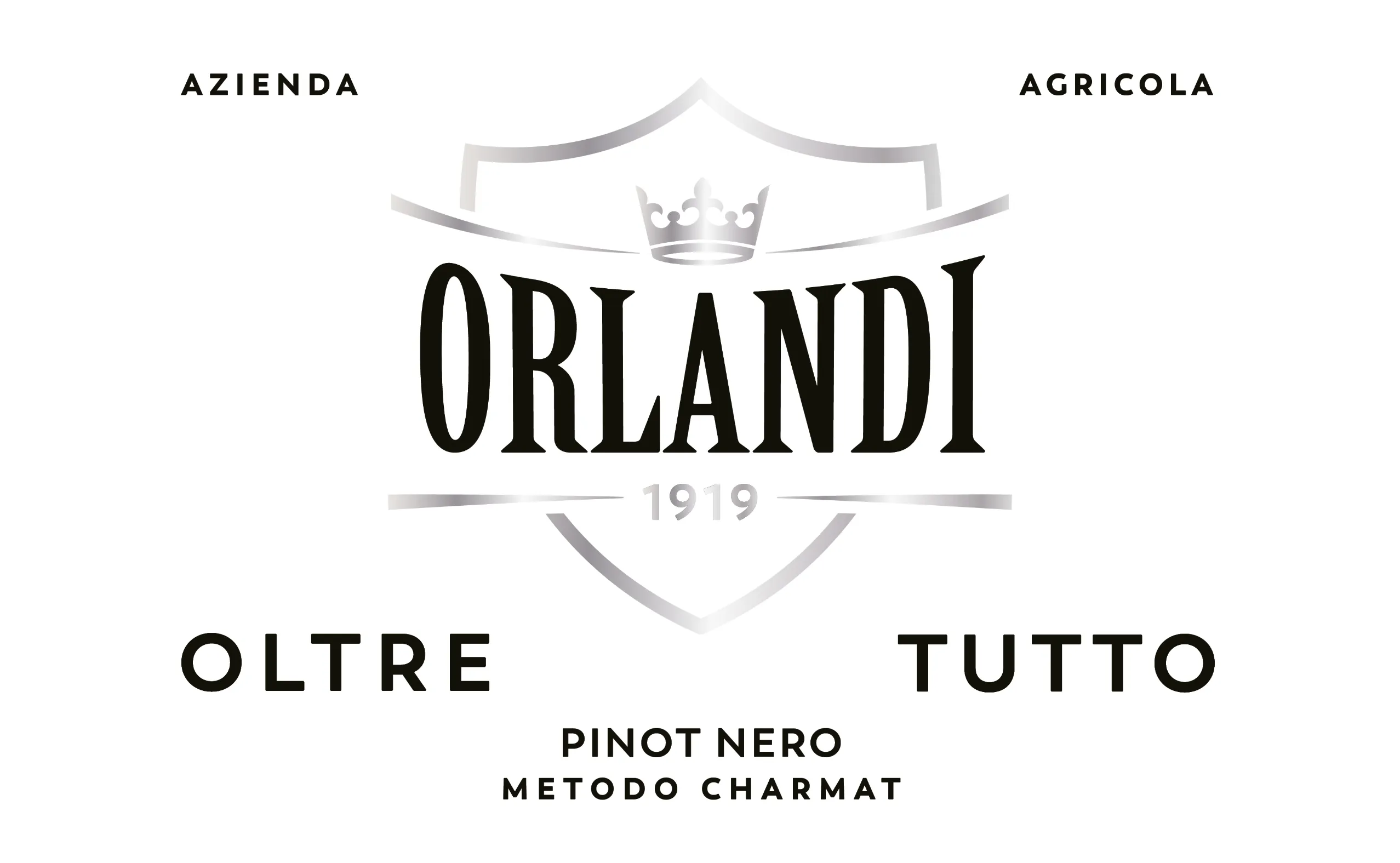
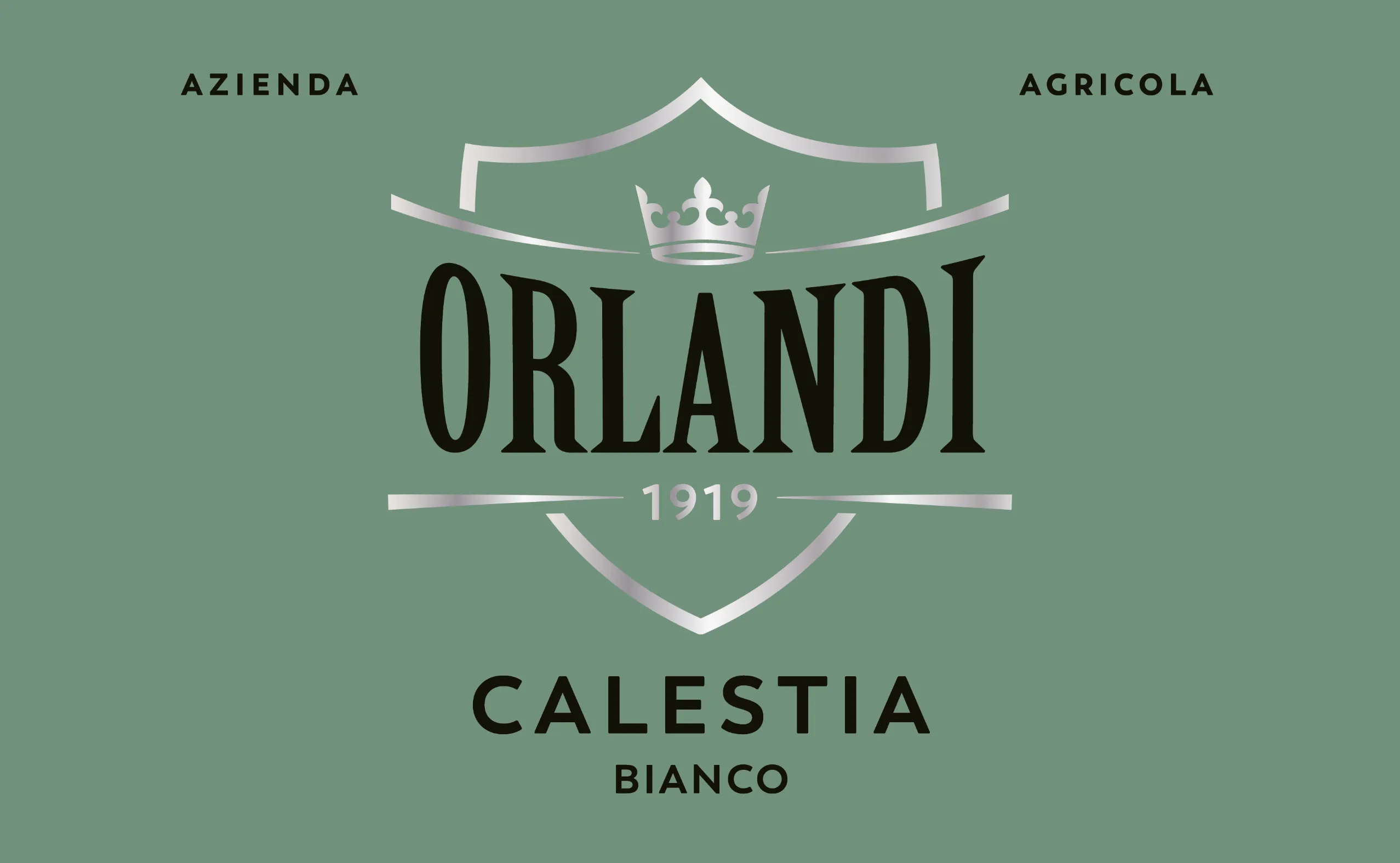
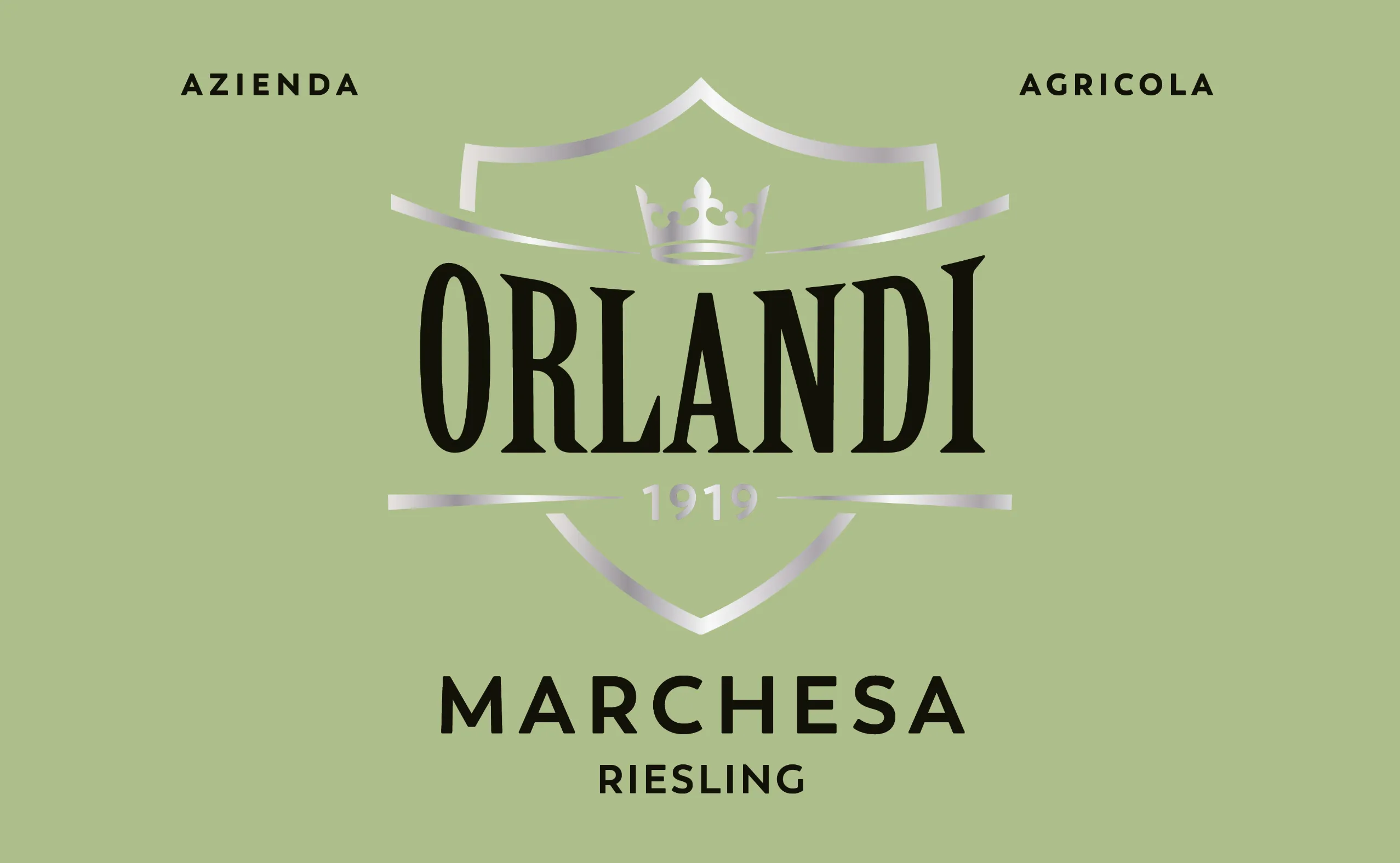
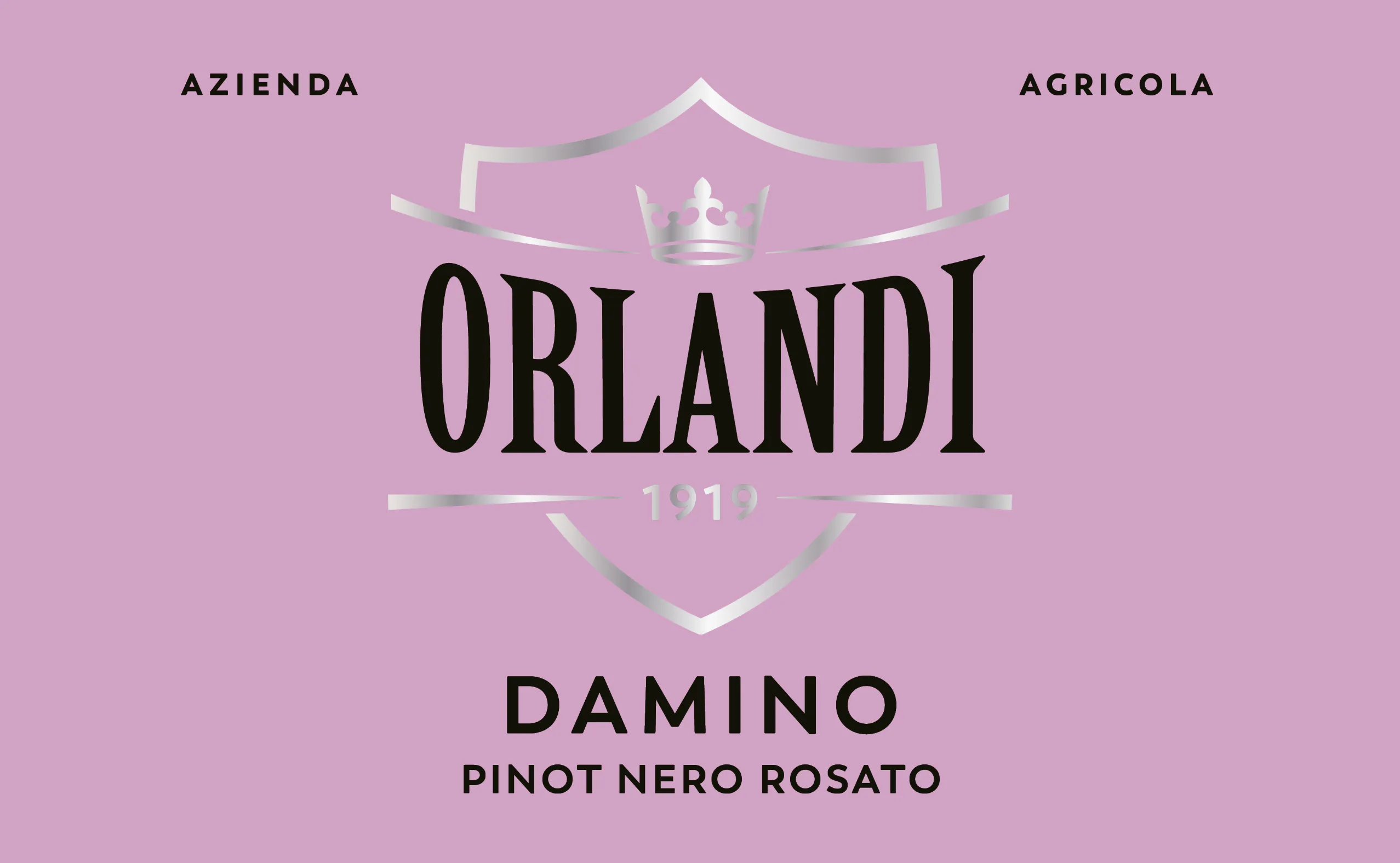
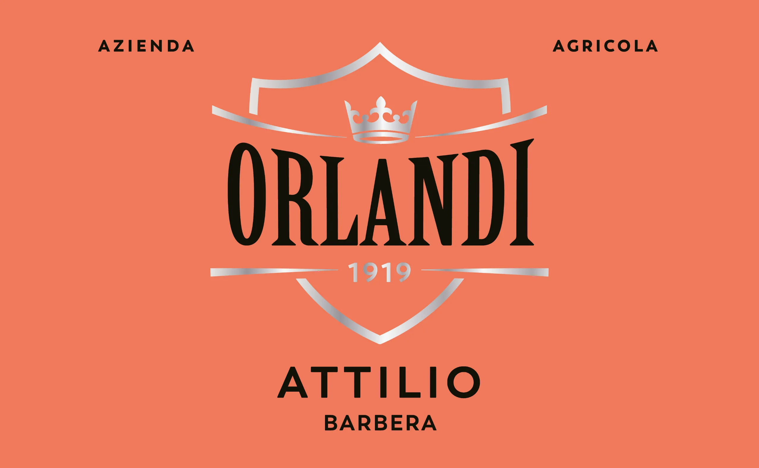
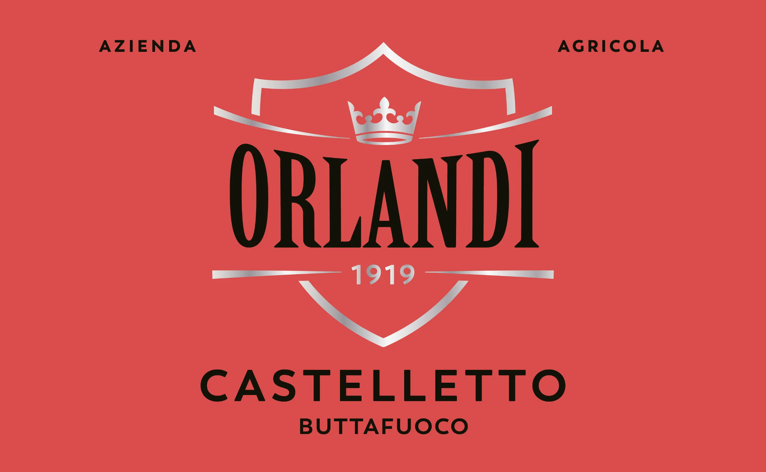
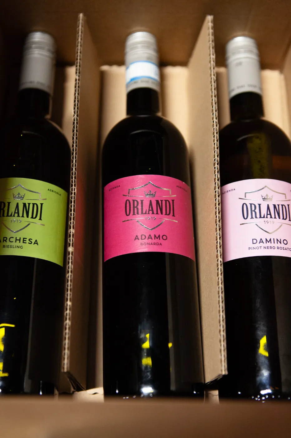
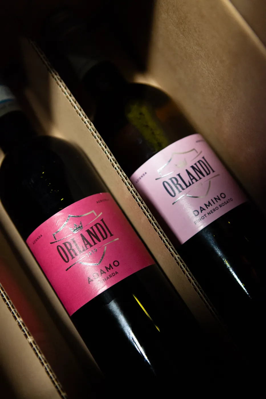
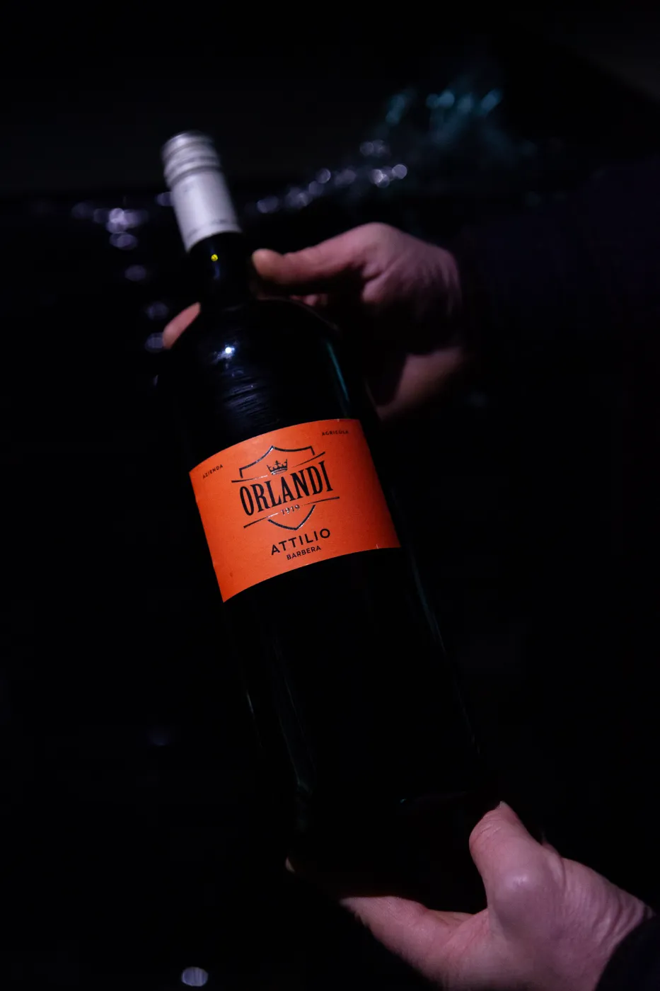
From there, the brand’s new identity extended naturally across the product labels, brought to life through a bold, expressive color palette and distinctive names for each individual product.
Outcome:
- logo and visual identity refresh
- brand language development and implementation
- product renaming
- label design (master and range adaptations)
- secondary packaging design
- product photography and art direction
- website redesign and development
- e-commerce setup and integration
- new stationery and company profile design
Mandatory:
- Label size – given
- Bottle shape & color – given
- Cork’s material & color – given
- Label’s typology of paper – given
- Label’s number of colors – 2 + 1 embellishment