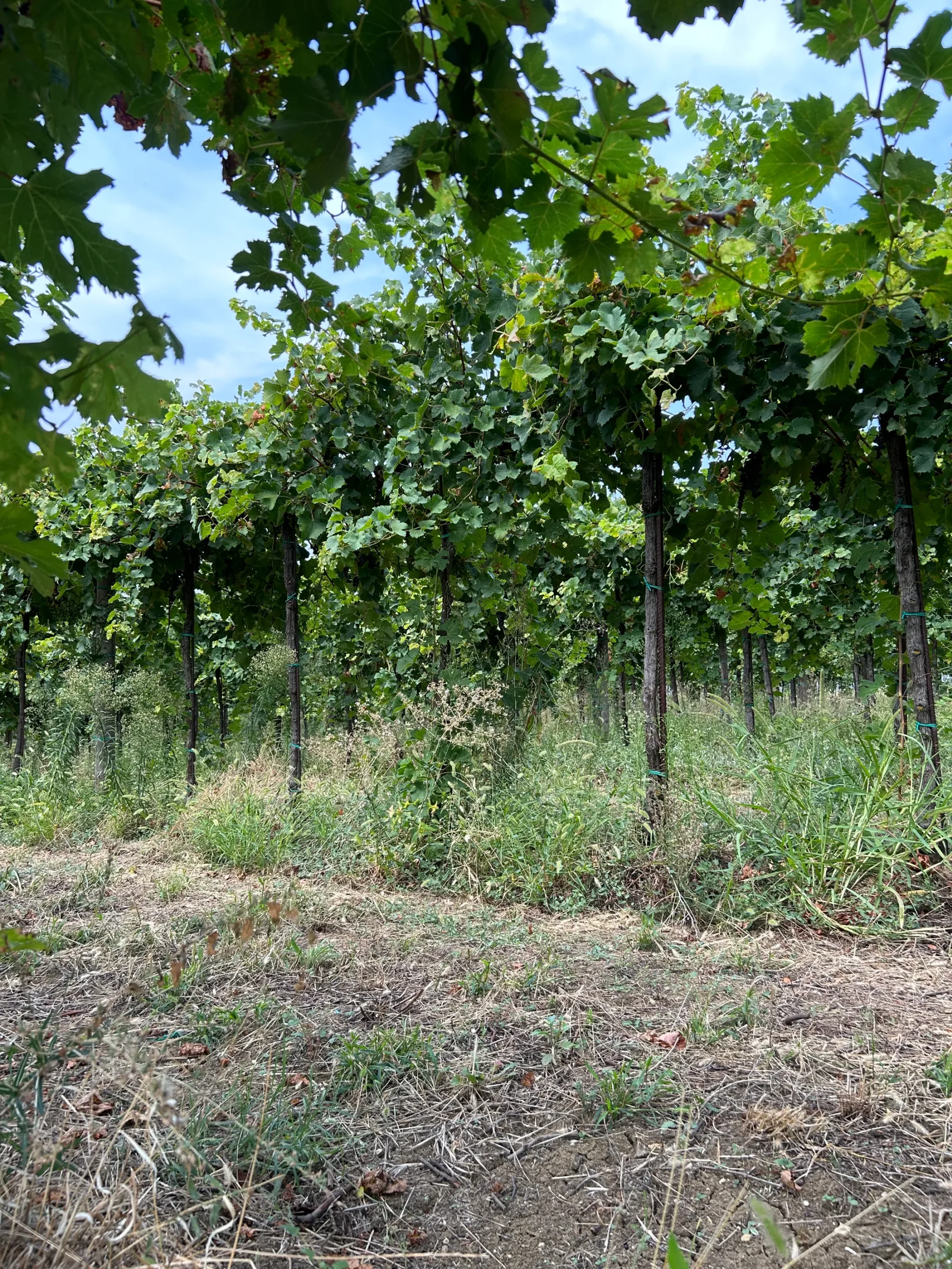
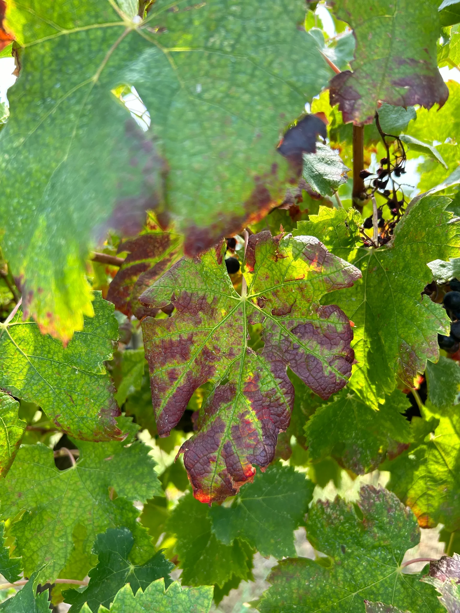
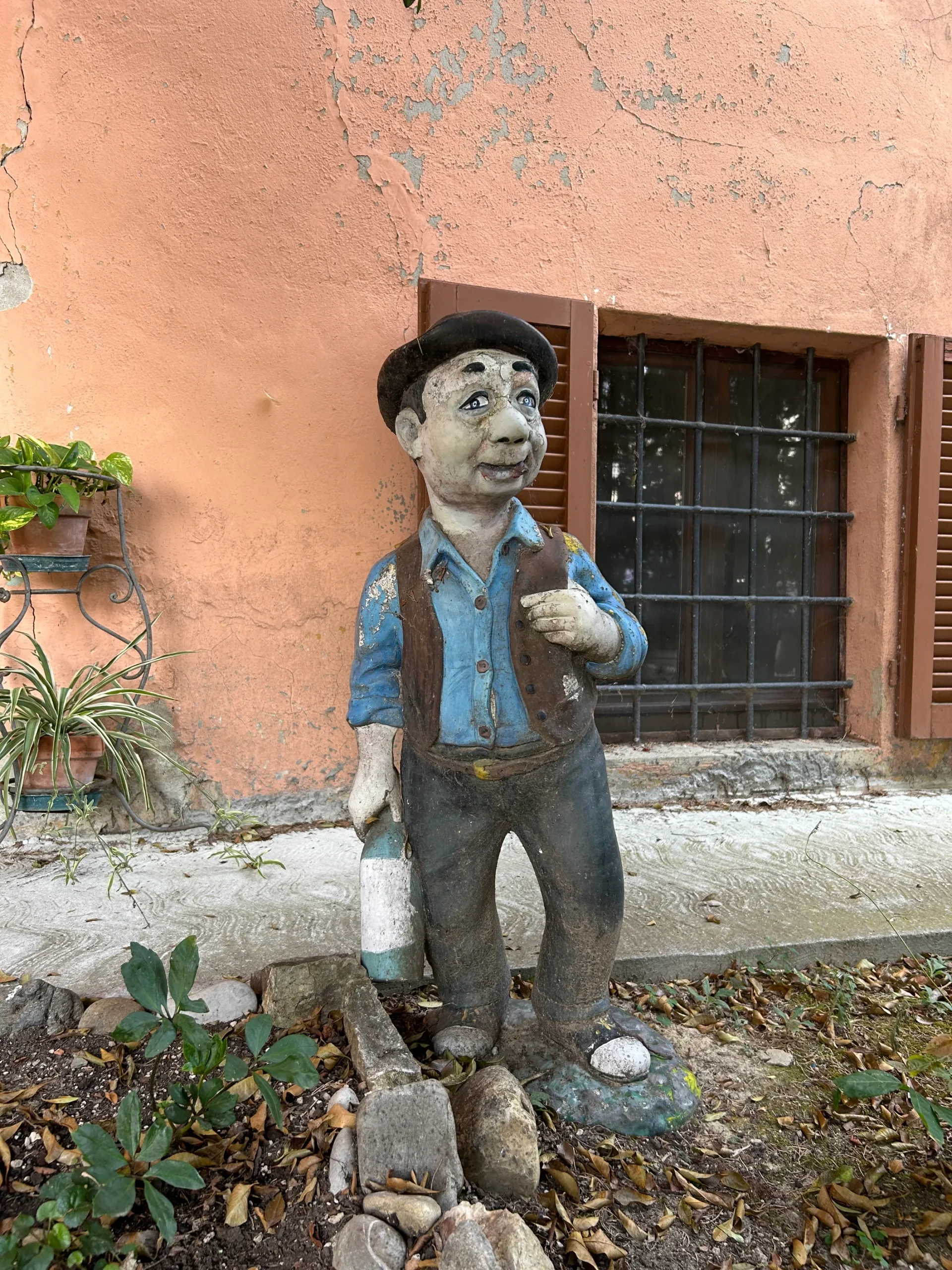
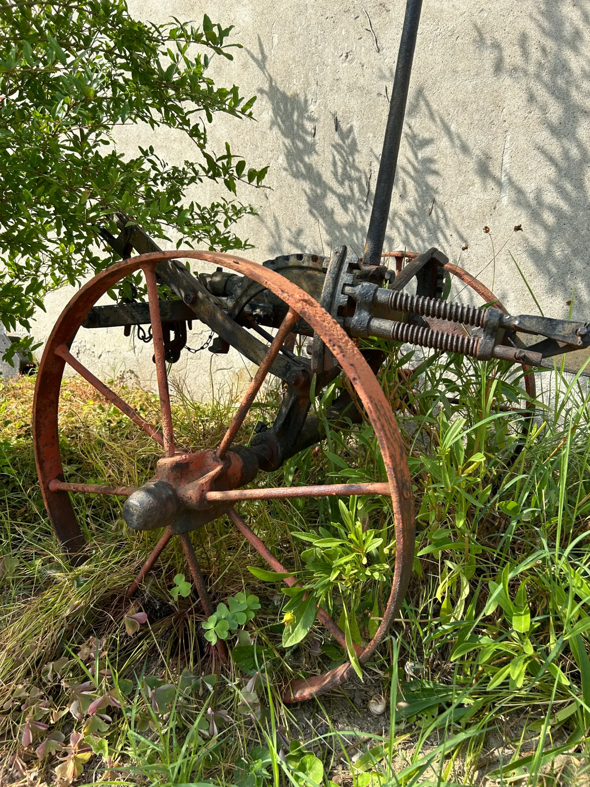
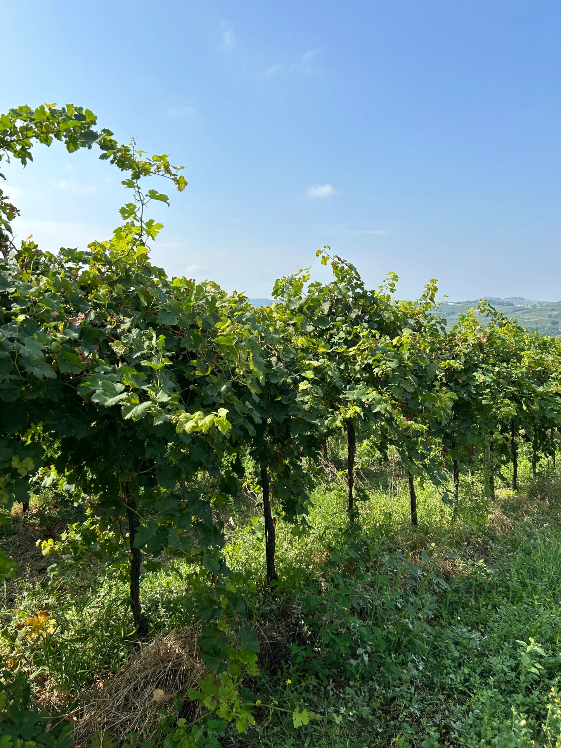
More than a century of love and passion for the land and wine.
Client:
Associazione Icaro
Year
2025
Services
Branding
Design
Creative Direction
Country
Italy
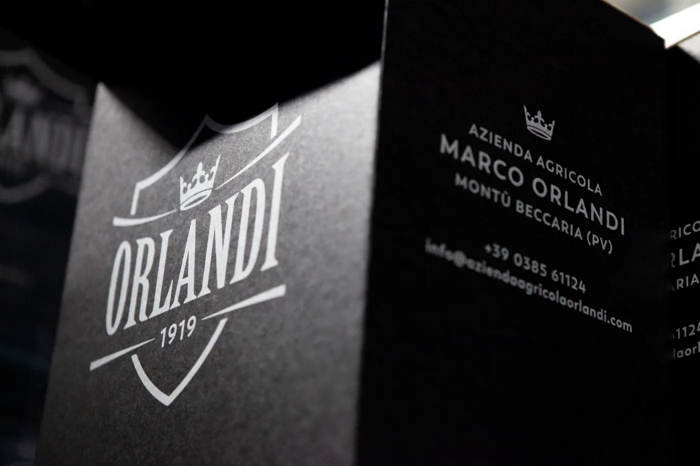
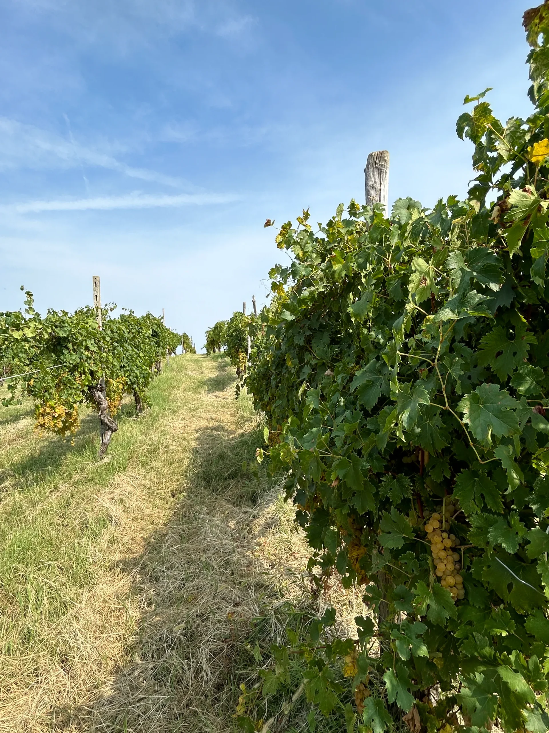
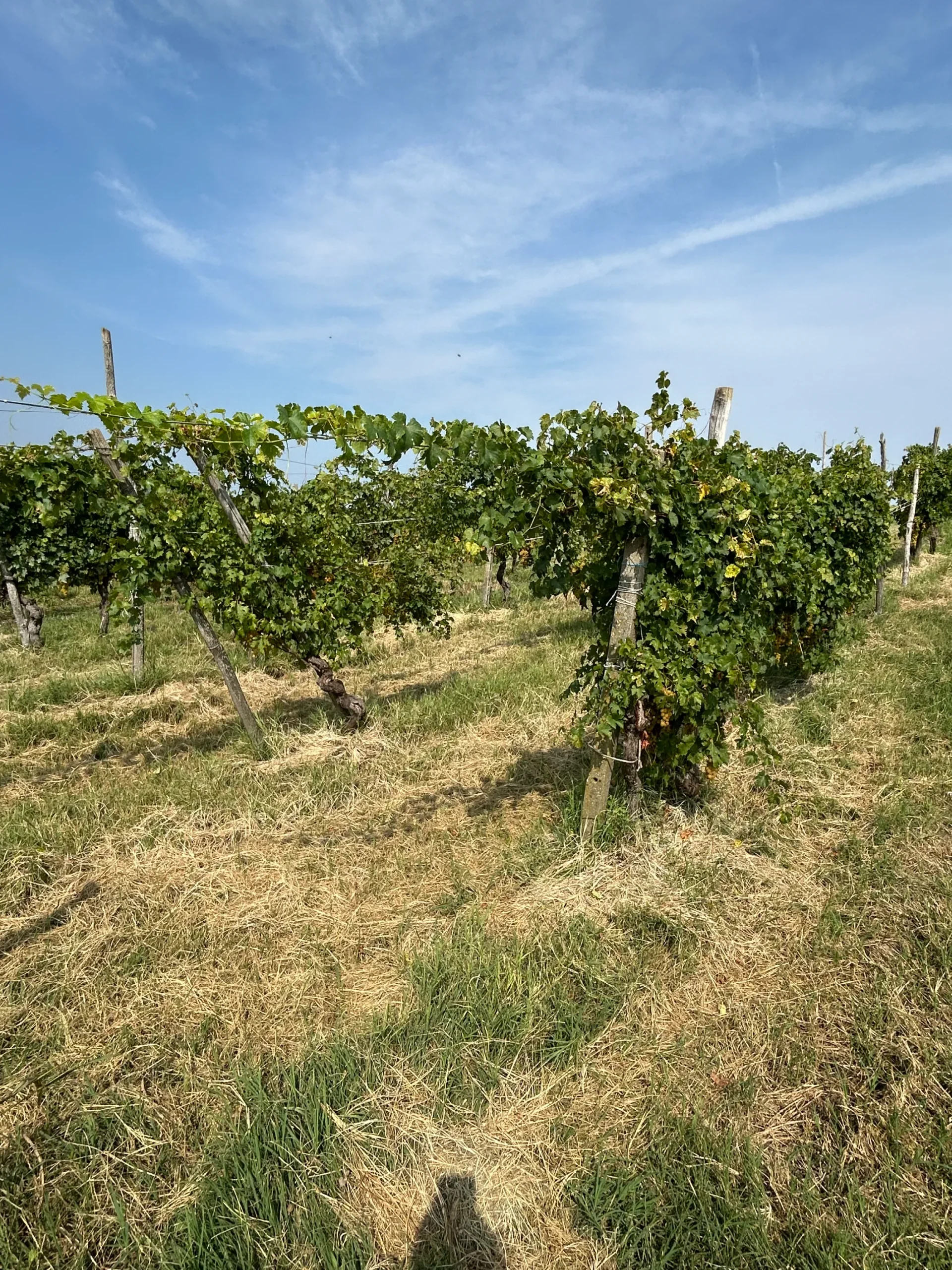
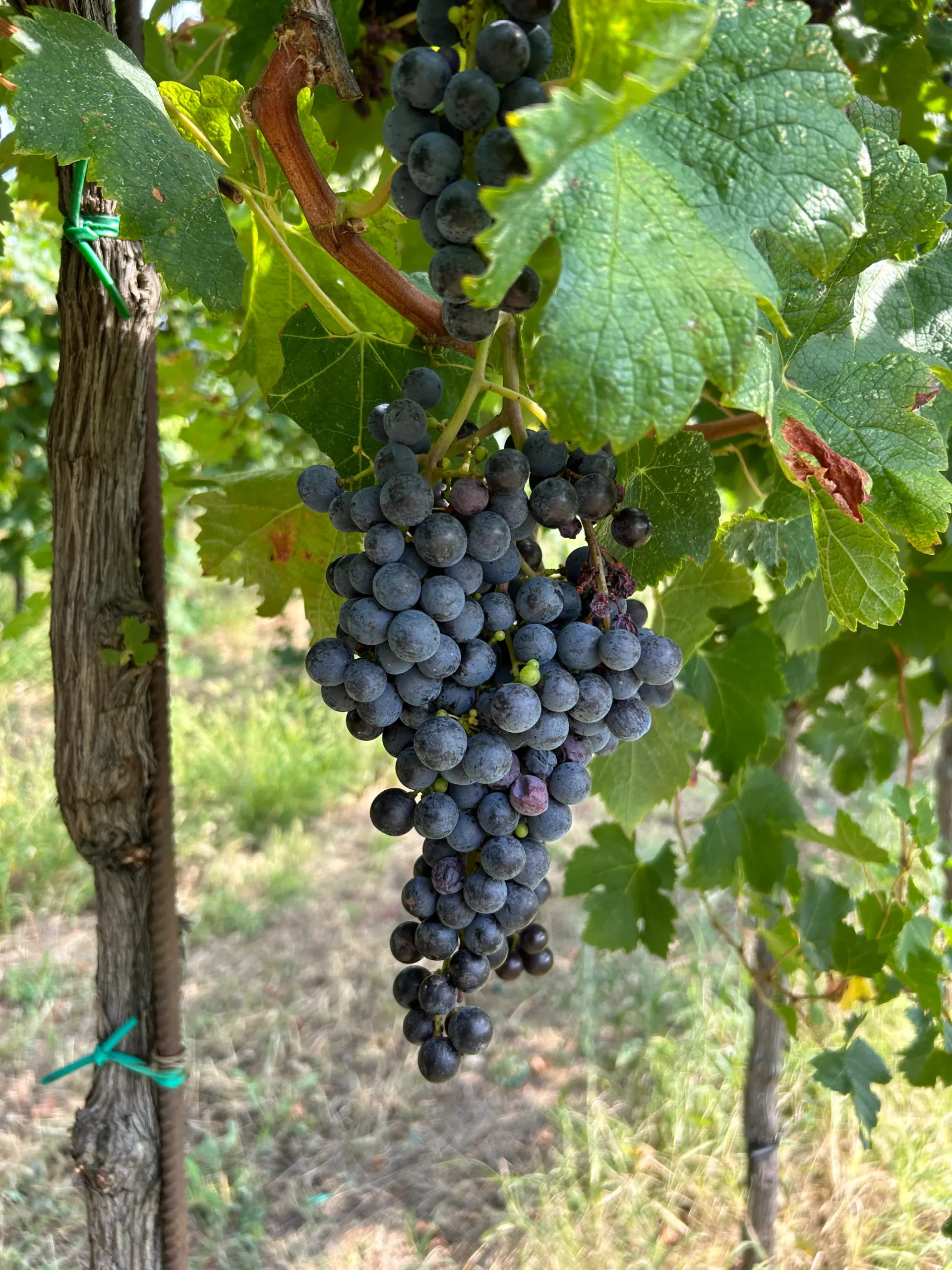
Brief: Azienda Agricola Orlandi is one of the historical wineries of the Oltrepò Pavese region. Founded in 1919 by Attilio Orlandi, it has grown over four generations into a family-run business with deep roots and an extensive portfolio. Initially focused on the packaging of Oltretutto, the project soon evolved. To truly communicate the value of this product, it became clear that the entire brand needed to speak with one voice. What began with a bottle, turned into a full rethinking of the Orlandi identity.
Work: We didn’t just design. We listened. We distilled. We worked closely with the Orlandi family to extract the essence of their story and translate it into a contemporary language that could hold space for both legacy and growth.
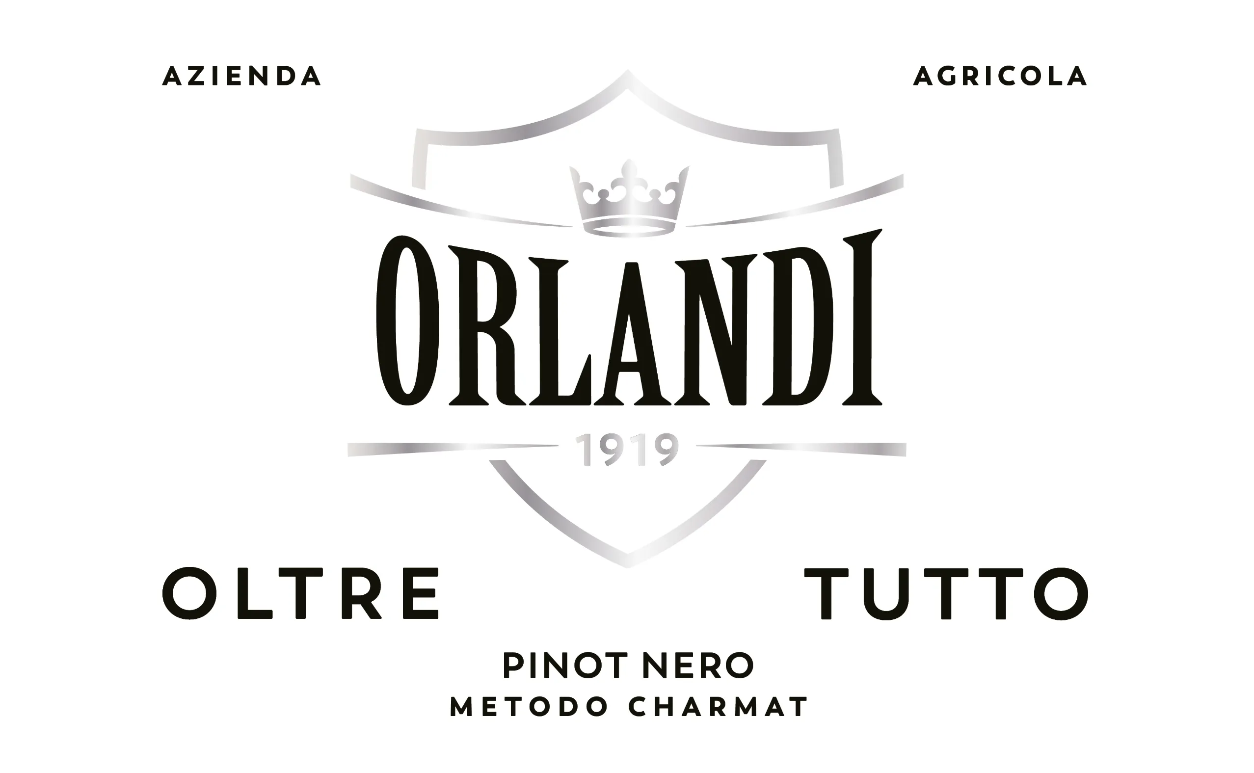
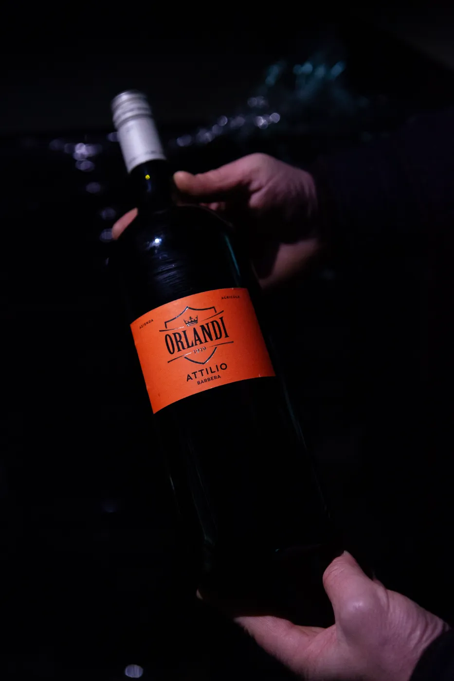
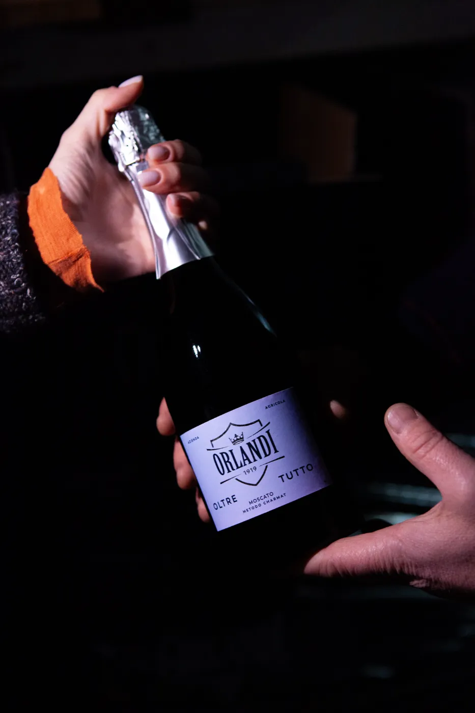
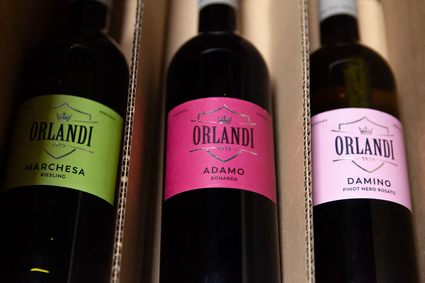
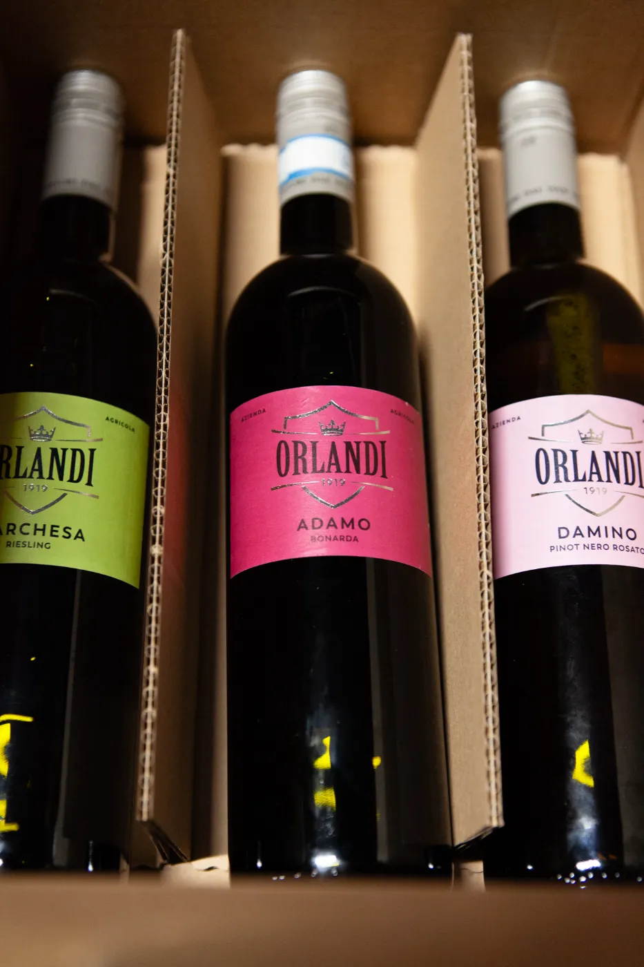
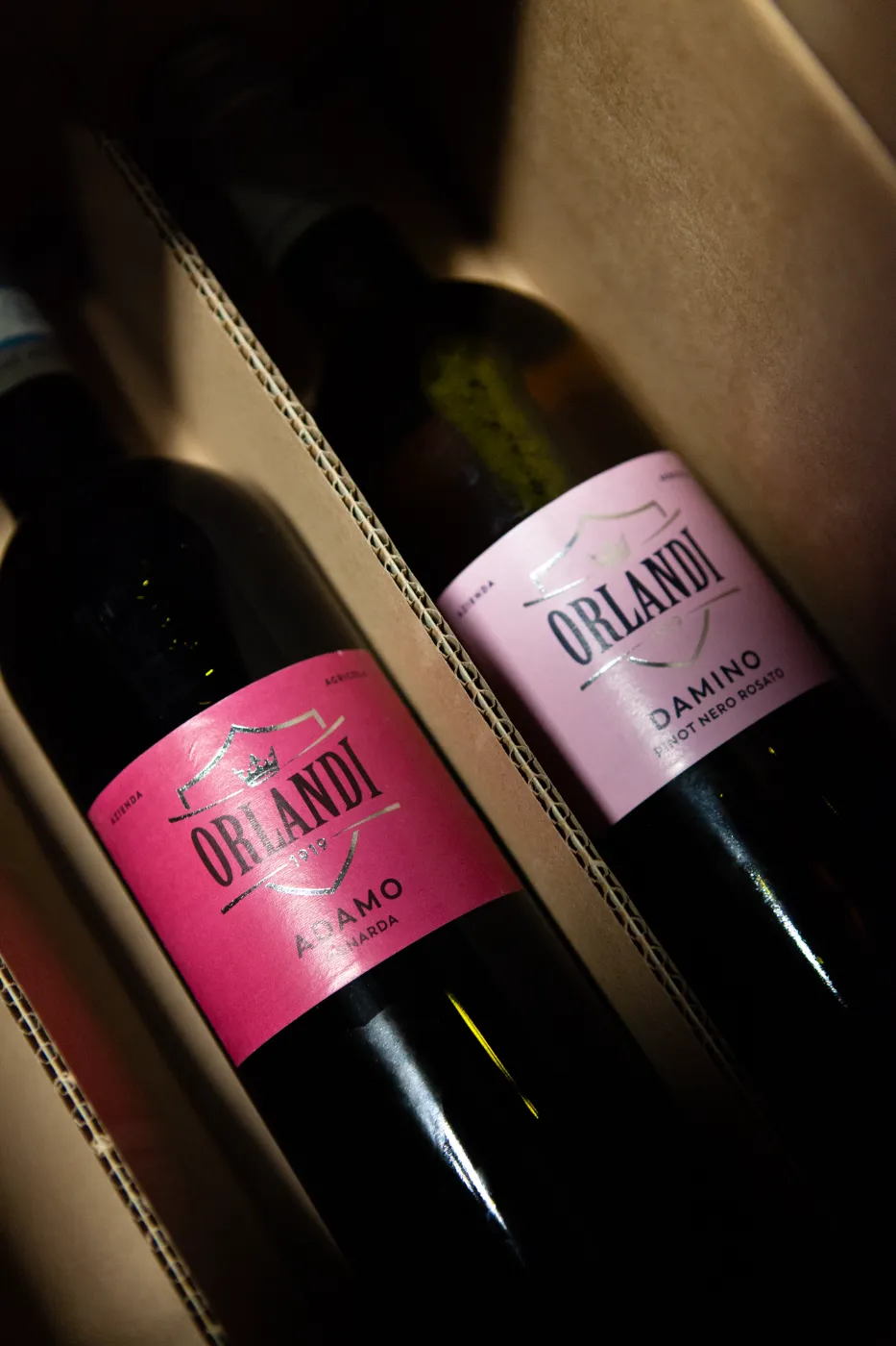
Outcome: We redesigned the Orlandi logo with a refined, essential approach: a mark that honours its heritage while opening to the future.
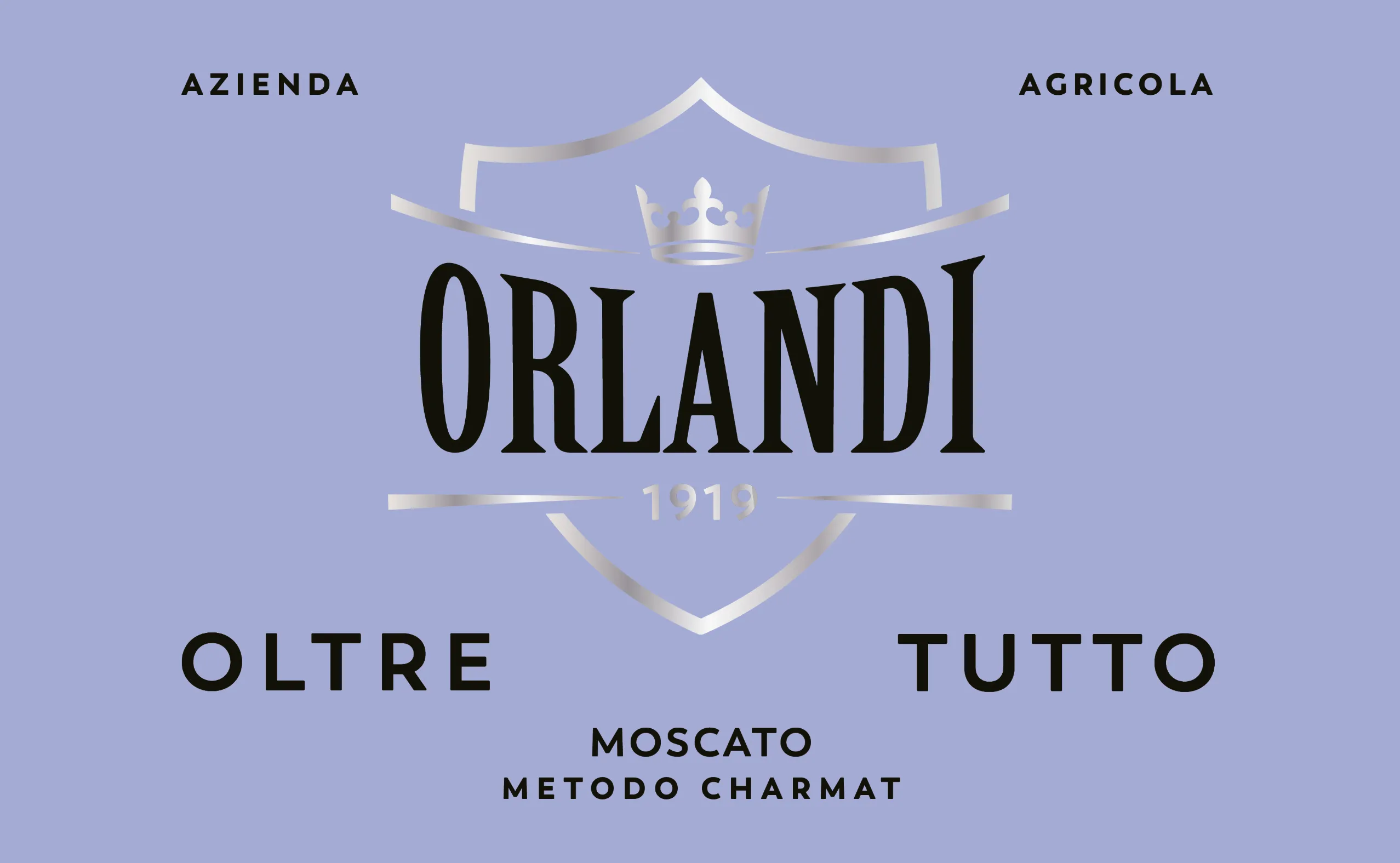
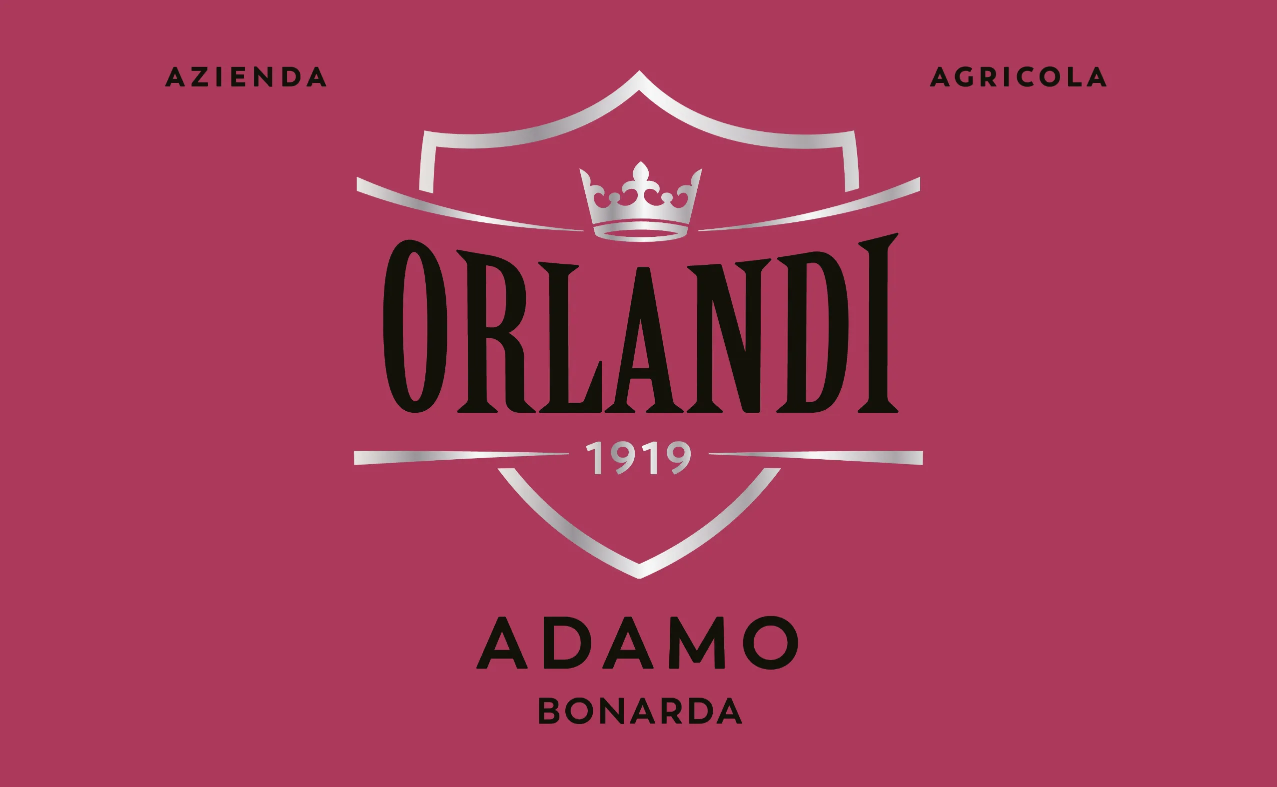
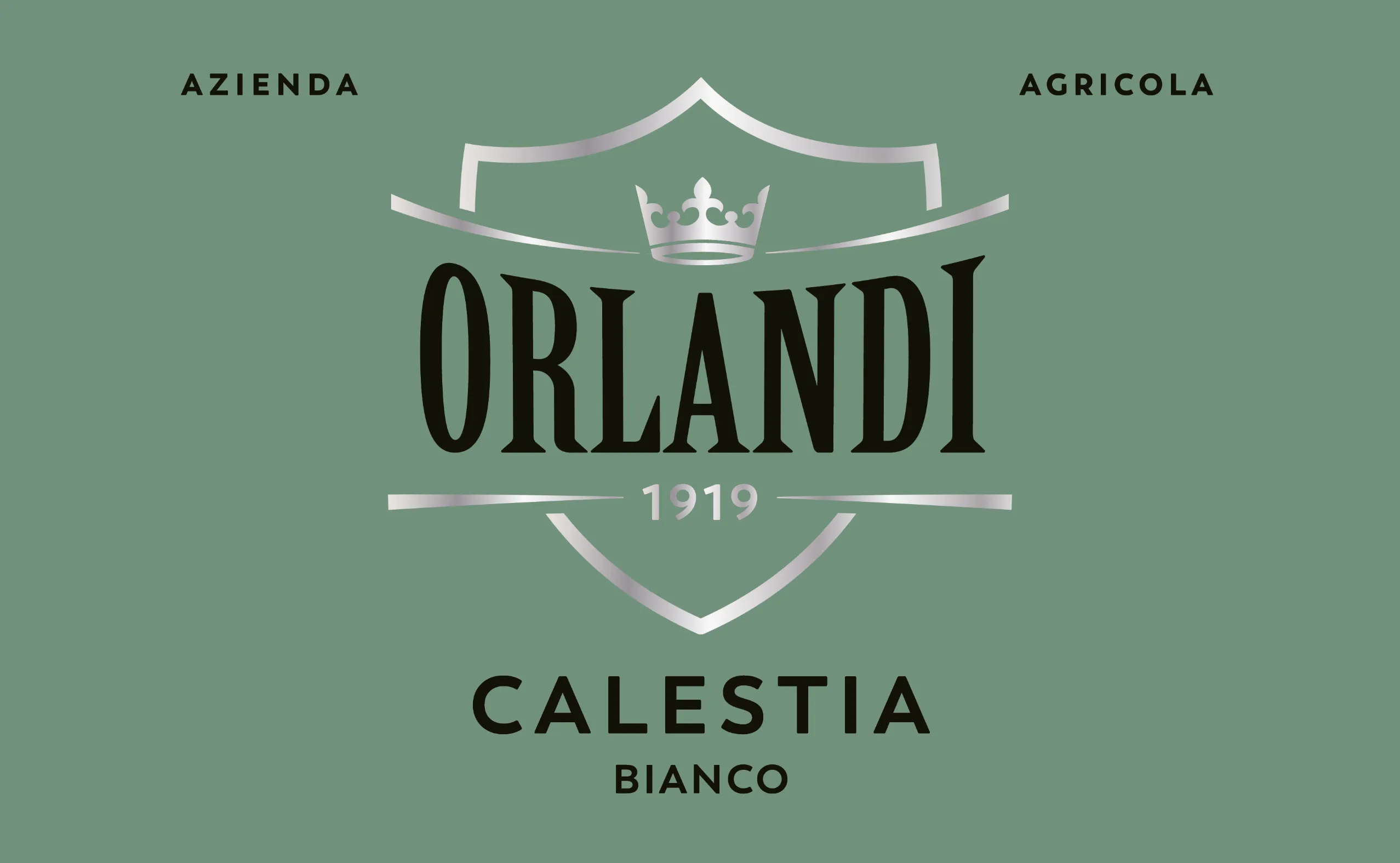
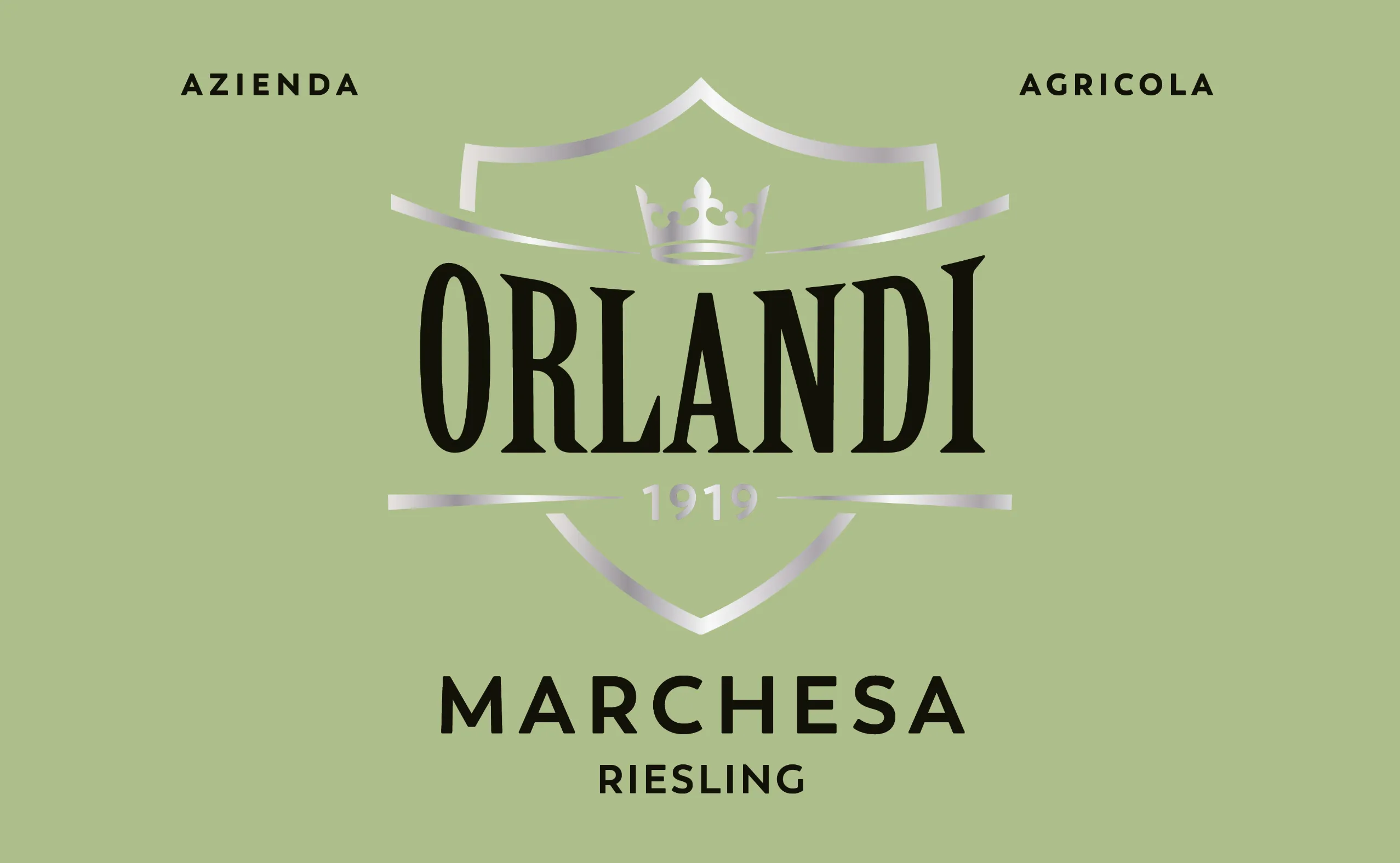
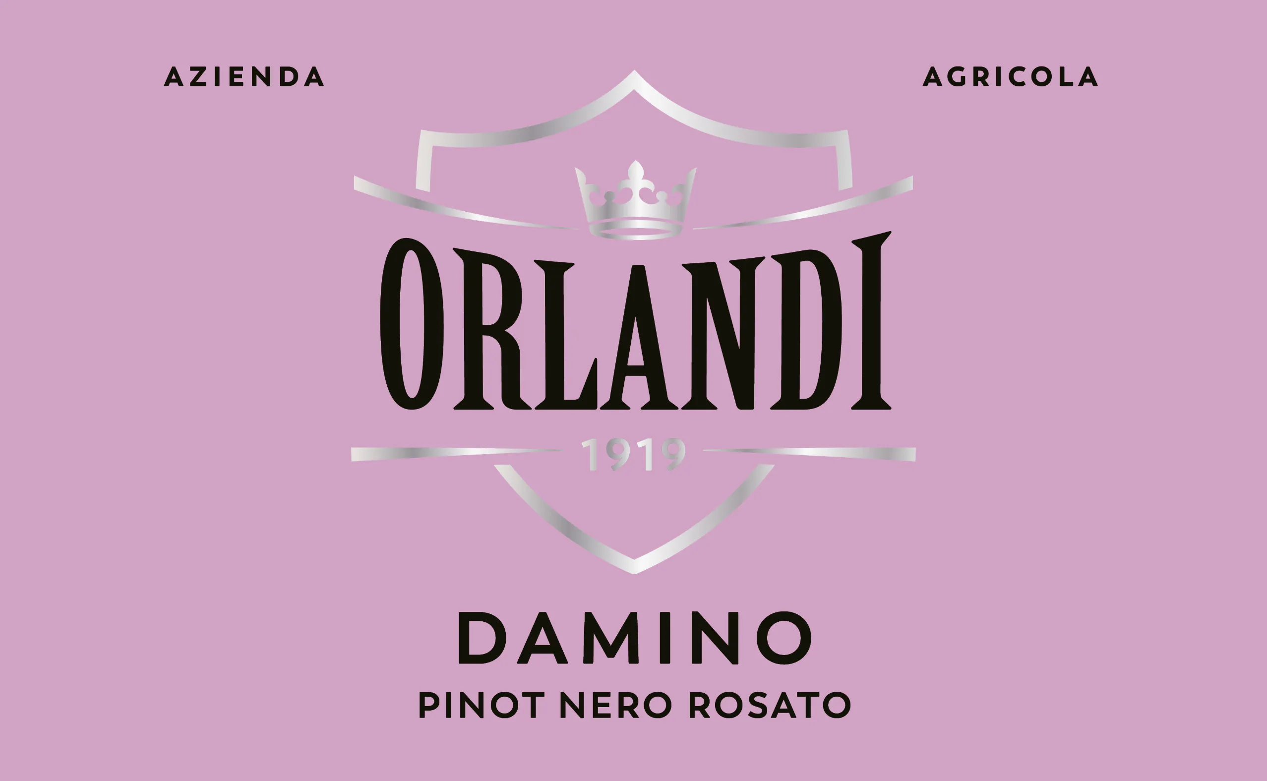
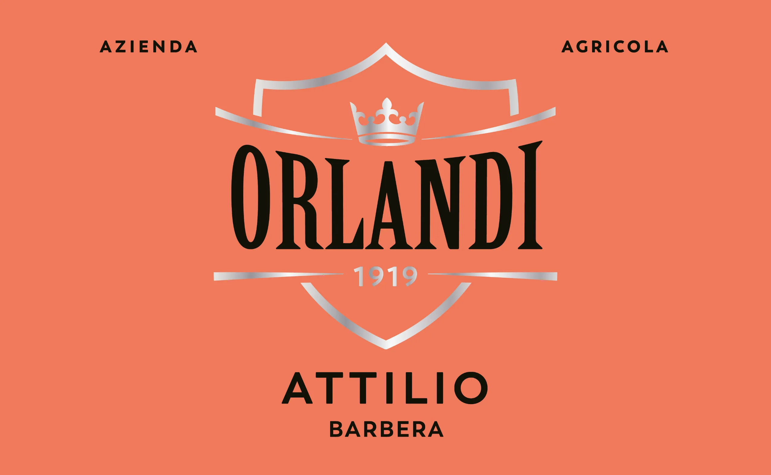
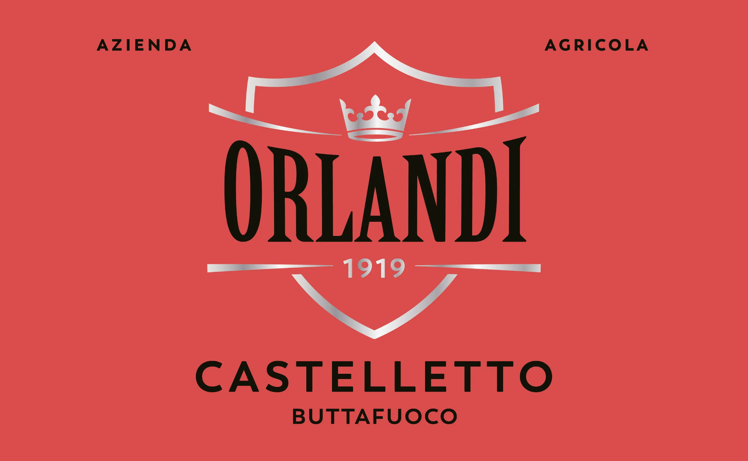
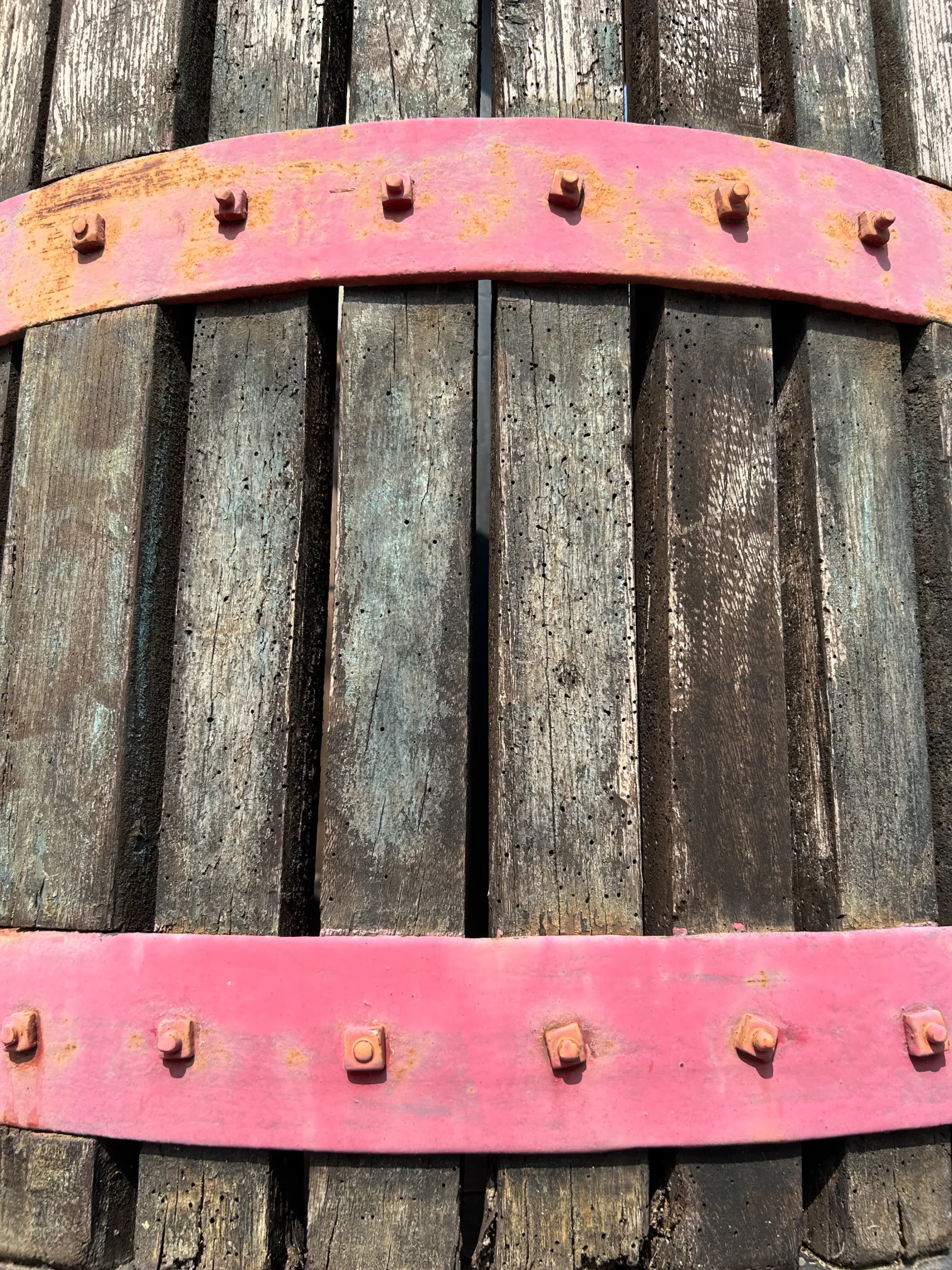
The visual identity comes to life through bold, characterful colours and carefully balanced elements that echo the essence of the Orlandi family: strong, rooted, and unmistakably genuine.
The label design reflects the simplicity and authenticity of the local product, while expressing the wine’s individual personality – given its own name to speak directly to the audience. It’s a synthesis of identities: the wine, the land, and the people behind it.